

Noah’s Ark:
Humanizing a lost-pet app
Role: Freelance Product Designer
Scope: UX Audit, Research, Interaction Design, Prototype, Validation
Duration: 6 Weeks
Overview
Noah’s Ark is a lost-pet recovery application designed for pet owners to take action when their pet goes missing. By converging reporting tools, pet profiles, community awareness, and search functionality into one app, Noah’s Ark aims to increase their chances of recovery.
As the app needs to be there for people during a stressful and emotional time, I anticipated the experience to feel instant and comforting. However, I found it felt cluttered and hard to use. Calls to take urgent action were being interrupted by social features, membership information, store content and other miscellany. This made the core of what Noah’s Ark sets out to do feel diluted.
This project focused on redesigning Noah’s Ark as a more human-centered lost-pet recovery tool, one that prioritized speed, clarity, and emotional support over engagement mechanics.
Problem statement
Pet owners in crisis need a focused and emotionally supportive reporting tool. However, feature overload and transactional tone increased cognitive stress and reduced trust during urgent moments.
Evaluating the current experience
I conducted a task-based walkthrough audit to identify friction across core user flows:
Report a missing pet
Report a found pet
Create and manage a pet profile
In addition to primary flows, I evaluated how secondary systems, including social feed mechanics, donations, monetization, memorial features, and gamification, influenced the reporting experience.
Key systemic issues identified:
Engagement and monetization features competing with crisis actions
Fragmented navigation patterns across reporting and profile management
Inconsistent task hierarchy between active search and memorial flows
Cold, transactional copy during emotionally vulnerable moments
Social media landing fee
Navigation reflects multi-product identity (social, store, global), not crisis-first hierarchy.
Crisis Action Is Not Primary
Encourages browsing rather than urgent action.
Engagement interactions mirror social media patterns
No immediate visual pathway to report a missing pet.
Landing experience prioritizes social feed over crisis action.
Pet profile
Memorial creation placed within an active search context: Blurs the boundary between recovery and loss.
Competing Mental Models
Profile management and crisis tools are grouped together.
Redundant Navigation Paths: “Edit Flyer” is accessible elsewhere, too
Primary crisis action lacks visual priority
“Lost pet mode” vs “Followers and following” creates cognitive dissonance.”

Lost pet report
Monetization modal interrupts active crisis reporting flow.
Competing Primary Action
Point to “Fund Now” button
Visual emphasis shifts attention away from completion.
Emotional Mismatch
Marketing language during vulnerable moment
Transactional tone contrasts with emotional context.
So what’s going on?
1. Feature Overload & Priority Conflict
Crisis tools competed visually and structurally with non-urgent features like donations, store creation, and matching mechanics.
Insight: The product lacked a clear hierarchy of urgency.
2. Navigation Fragmentation
Wallet accessible in multiple locations
Profile & pet profile overlapped
Store repeated in navigation
Inconsistent back behavior
No clear page hierarchy
Insight: Users could not confidently understand where they were in the system.
3. Emotional Mismatch
Swipe-based discovery and gamified patterns created an experience described as:
“It feels like Tinder.”
This interaction style conflicted with the emotional gravity of pet loss.
4. Reporting Flow Friction
Long, repetitive questions
No progress visibility
No reassurance after submission
The primary task was not treated as primary.
User Interviews
To validate audit findings, I conducted interviews with 5 participants. I recruited them from Facebook groups.
2 prior pet-loss cases
1 currently missing pet
1 unresolved loss
1 general pet owner
Crisis Amplifies Cognitive Load
Participants described long forms as overwhelming.
“It feels like interrogation.”
Design Implication: Reduce required fields and simplify structure.
Tone Directly Impacts Trust
Cold system language reduced confidence.
“Did it actually submit?”
Design Implication: Add clear confirmation and supportive messaging.
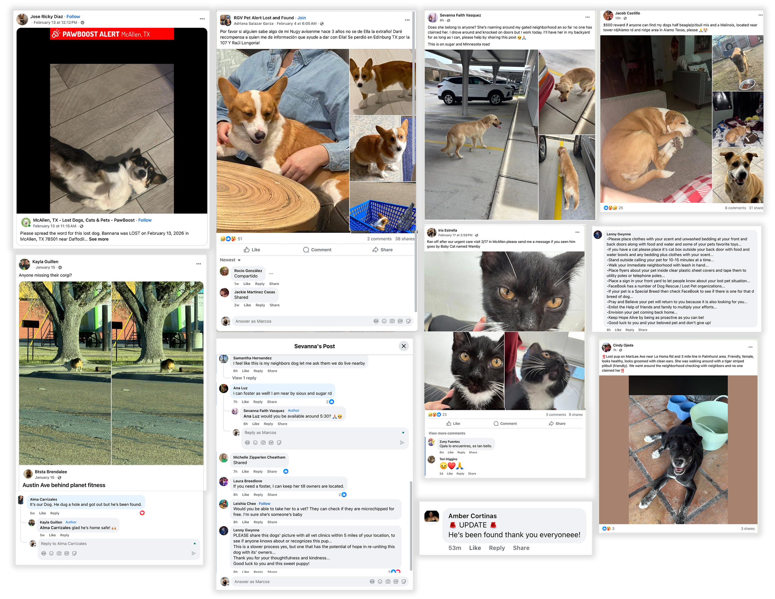
Recovery Is Community-Driven
Participants relied heavily on Facebook groups and image-forward posts.
Design Implication: Mirror real-world recovery behavior — image-first, location-forward visibility.
Insights from Real Pet Owners & Community Observation
In addition to interviews, I analyzed real lost-pet posts across multiple Facebook recovery groups, including communities I moderate.
A consistent behavioral pattern emerged:
Photo-first visibility
Last known location clearly stated
Direct contact information
Immediate reshares and geographic tagging
Urgent, emotional language (“Please help, she’s my baby.”)
Across breeds and cities, the goal was consistent:
People wanted eyes on the ground immediately — not engagement mechanics or feature discovery.
Recovery efforts were image-forward, location-driven, and community-powered.
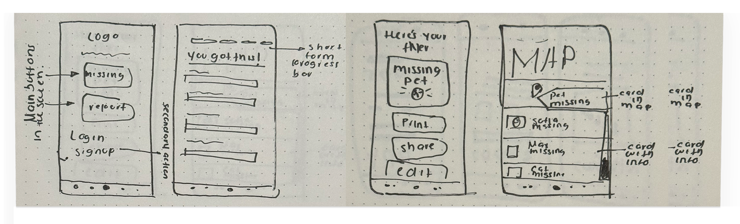
Sketches
Before moving into digital wireframes, I explored structural changes through quick sketches.
The goal was to:
Reframe the landing experience around crisis actions
Reduce entry-point ambiguity
Shorten and sequence the reporting flow
Separate urgent actions from secondary systems
These sketches helped validate hierarchy before investing in higher fidelity.
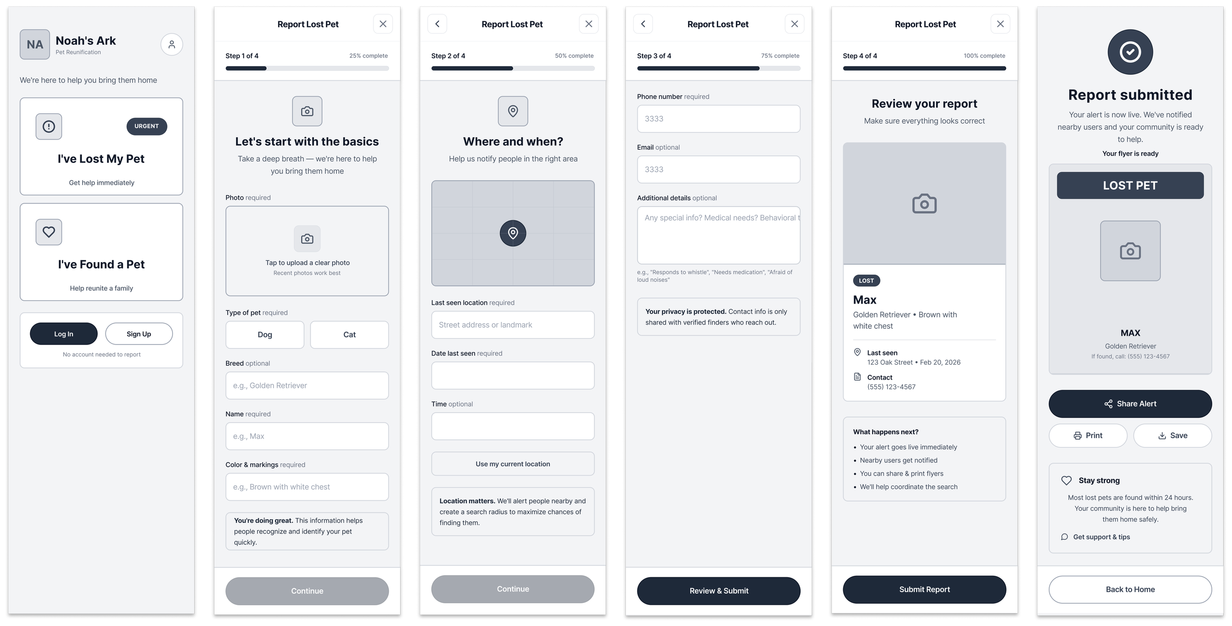
Mid-fidelity wireframes
The redesigned reporting flow focused on clarity, reassurance, and task momentum.
Key structural changes:
Progressive step indicator to reduce uncertainty
Clear separation of required vs. optional fields
Location-forward reporting with map integration
Review screen before submission
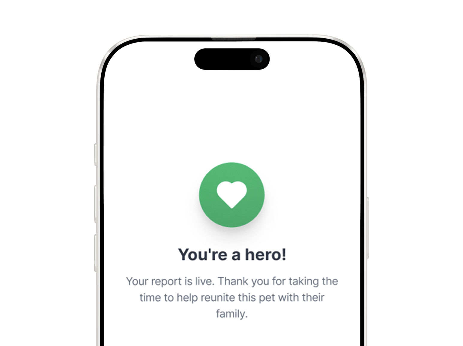
Immediate confirmation with next-step guidance
Share-ready alert for community visibility
The flow was intentionally reduced to four focused steps to maintain forward momentum during crisis states.
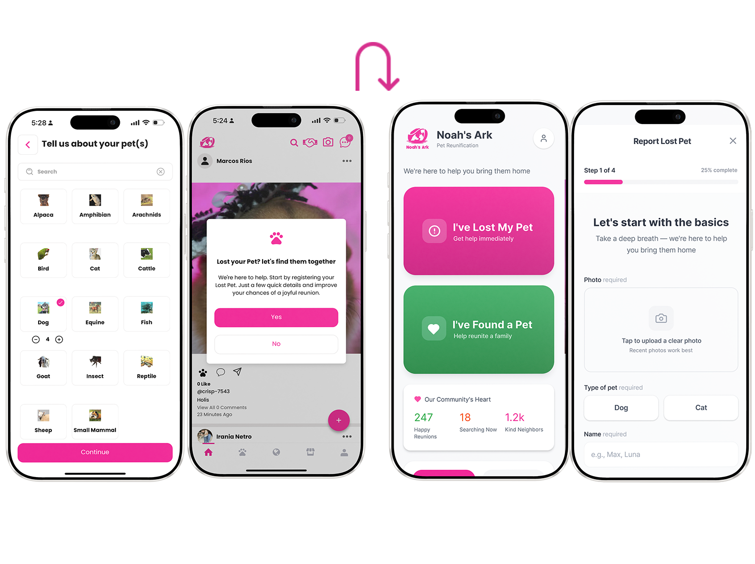
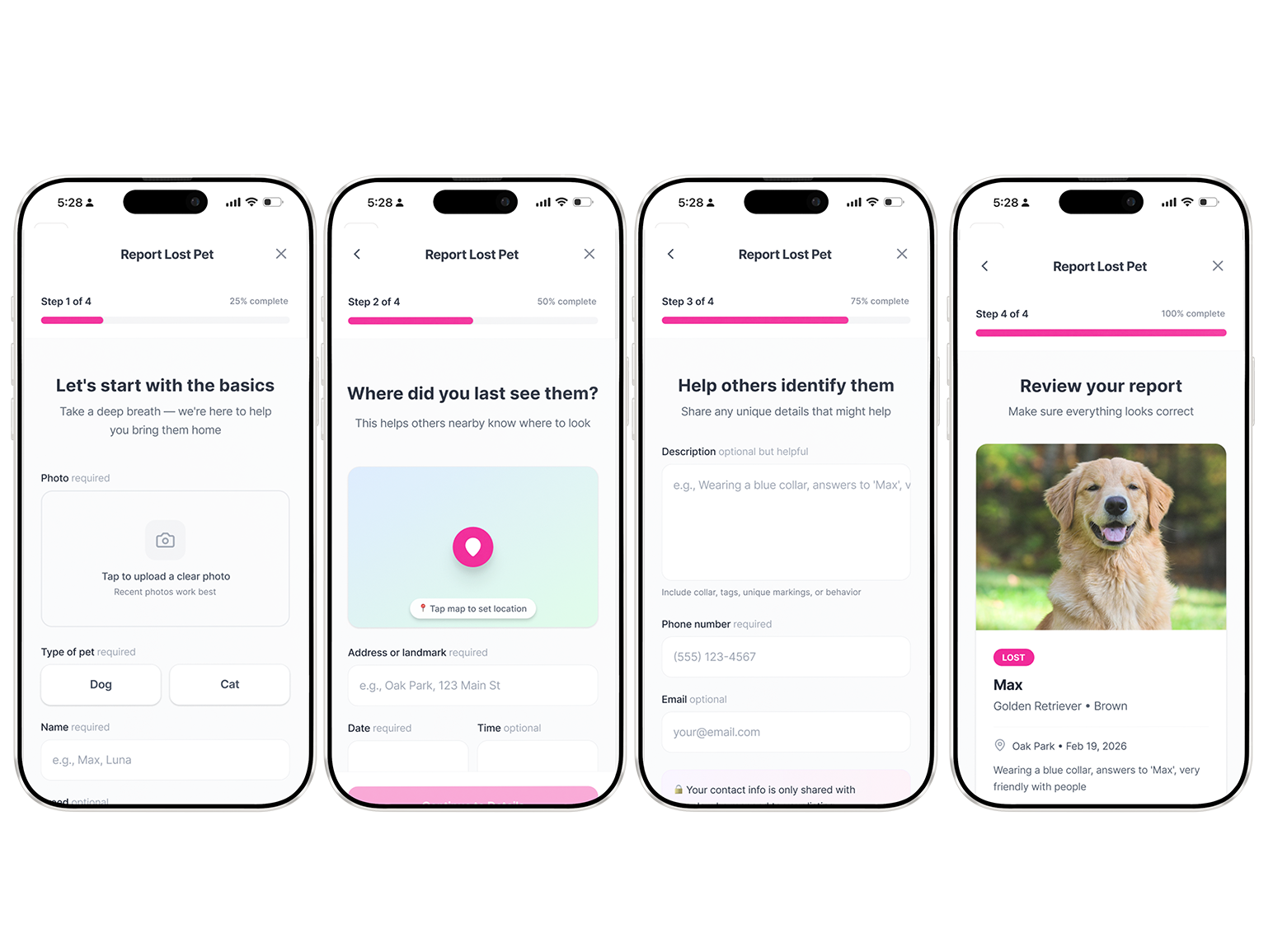
High fidelity + Key Changes
-
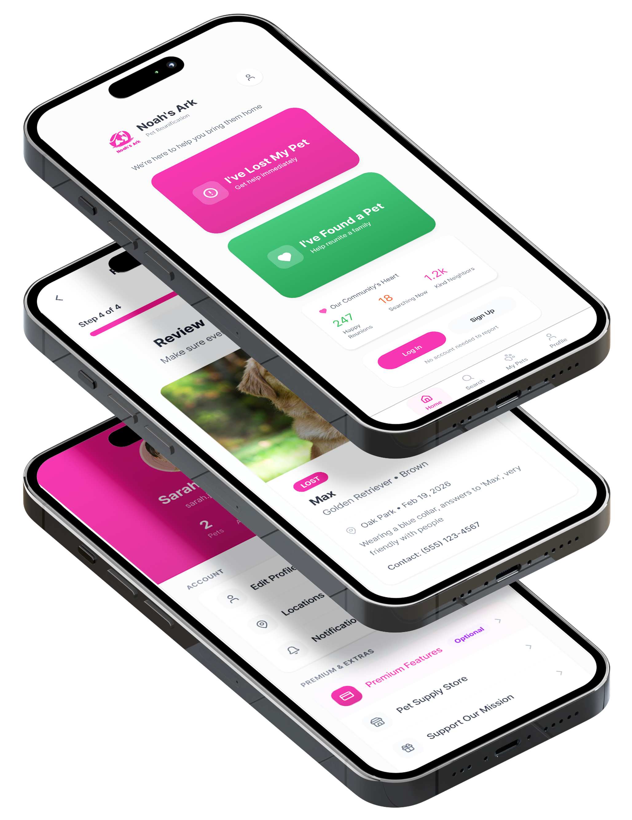
How owners report missing pets
Previously, owners had to go through forms and lengthy, tedious steps to report a missing or found pet. I simplified this. I also updated the tone of voice to make it feel more supportive.
-
Guided, dramatically shorter reporting flow
Clear step indicators, required vs optional fields labeled plainly, progress bar, encouraging microcopy (“You’re doing great, just a couple more details to help bring them home”).
-
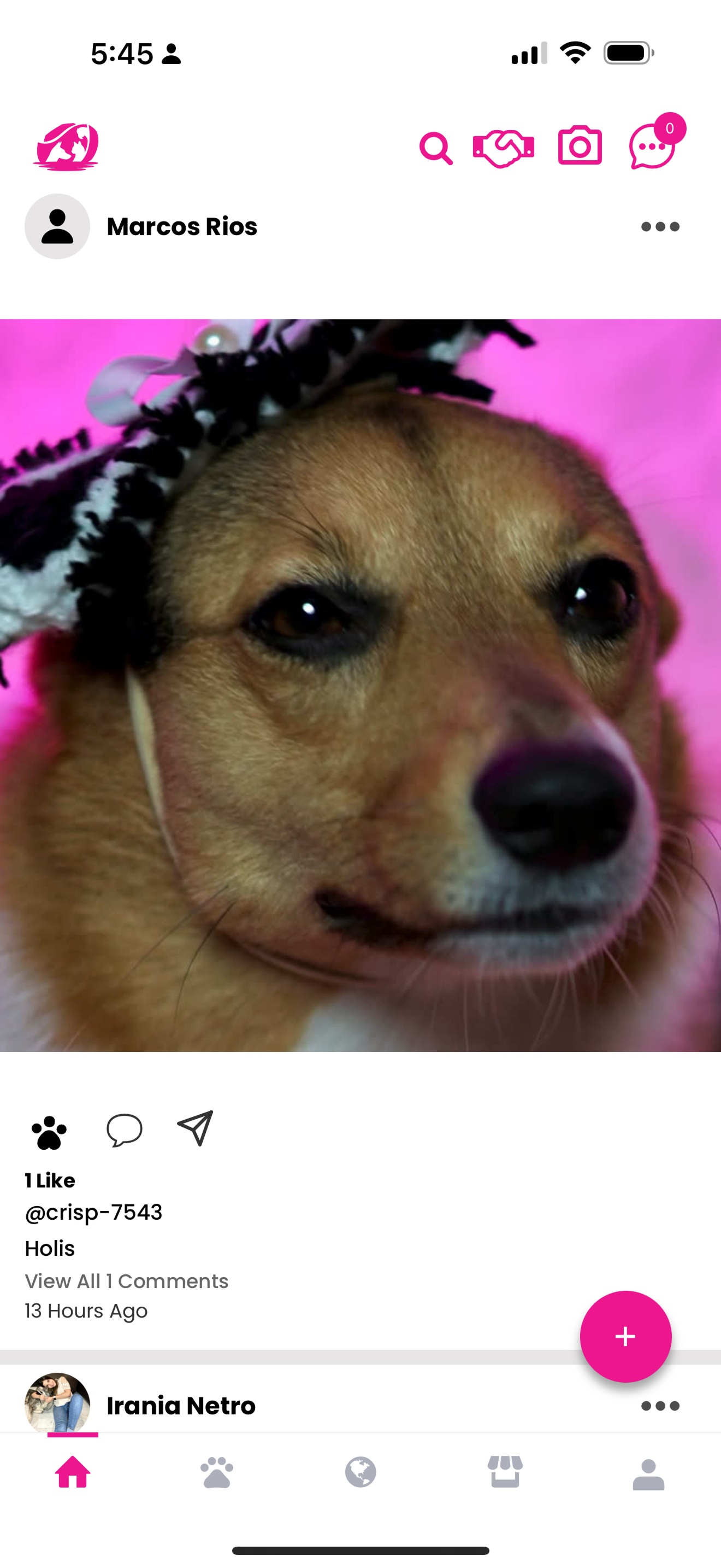
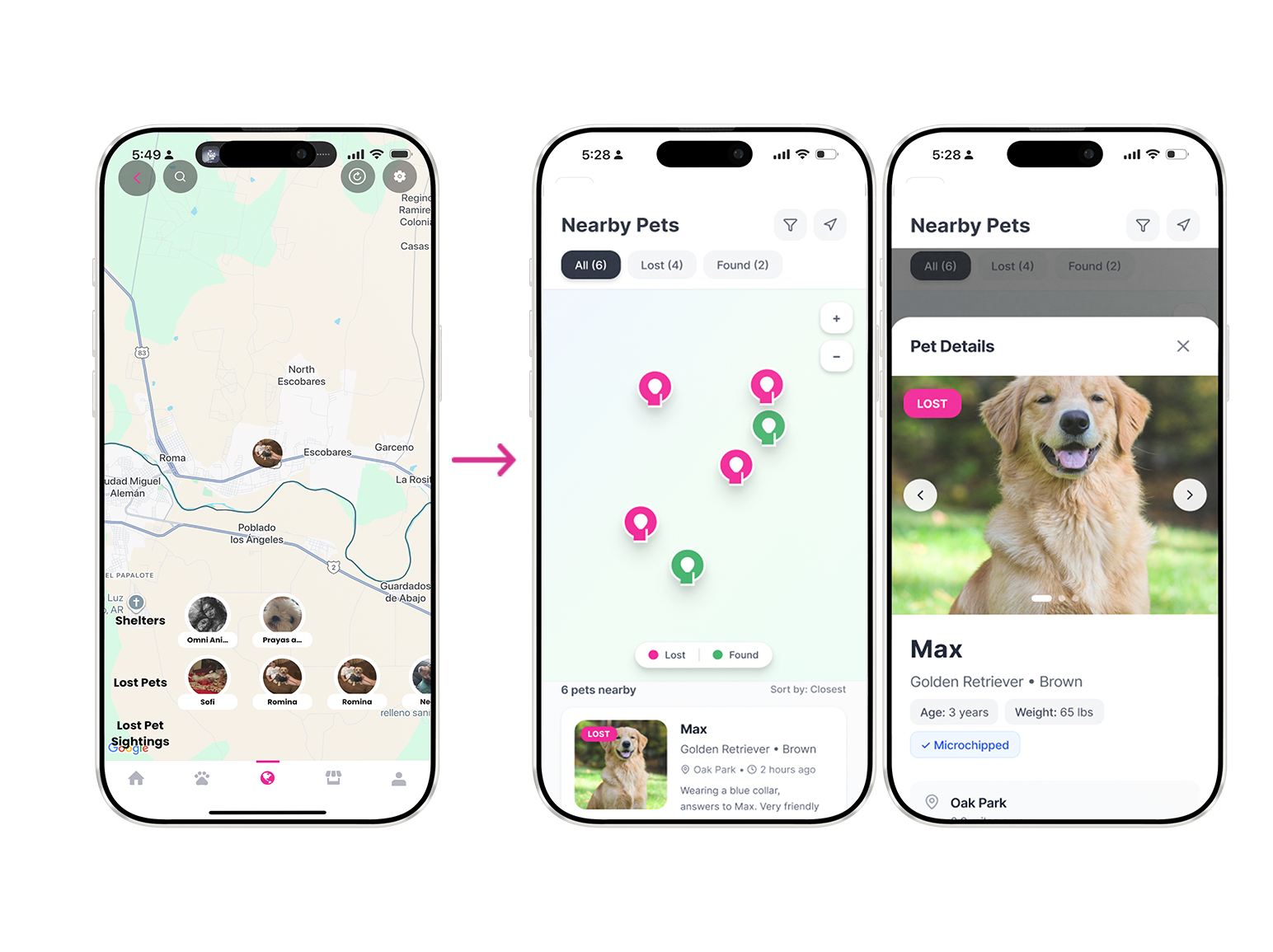
Map-centered lost/found search
Scannable cards with big photo + key info (location, time last seen, breed, contact snippet). No gamified swiping, just clean, glanceable posts like a neighborhood bulletin board
-
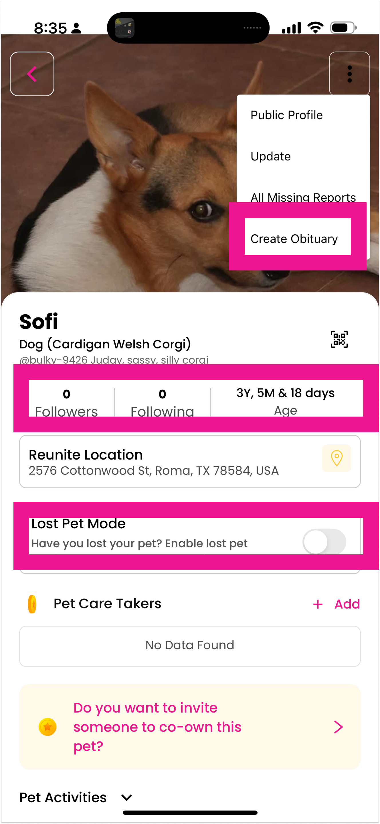
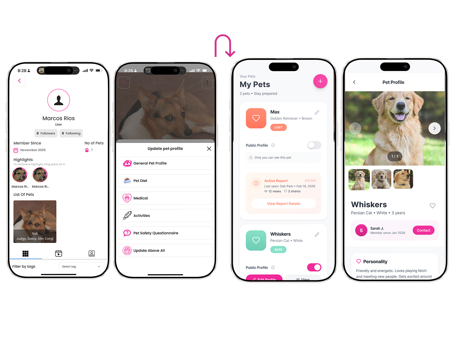
Simplified “My Pets” dashboard
One clear place to manage your animals, toggle lost status, see reports. Removed duplicate fields and confusing overlaps between pet profiles and user profiles.
-
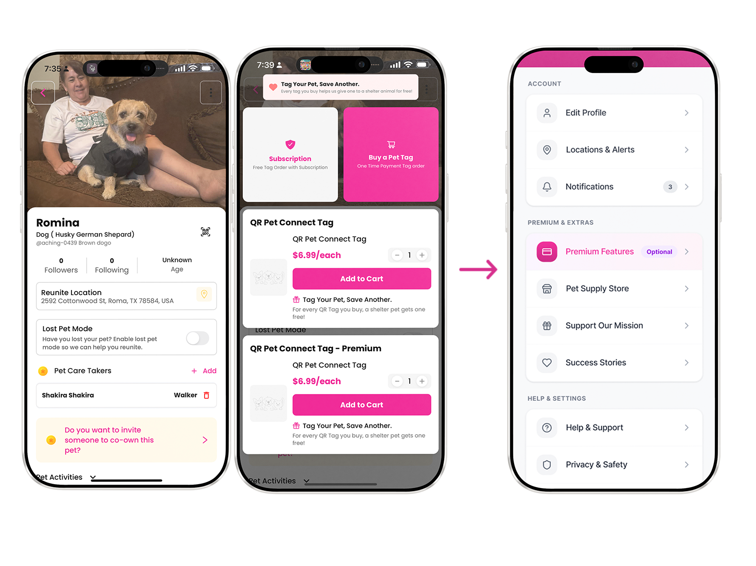
Monetization & membership moved off the critical path
Wallet, store, donations, premium features still exist , they’re just never interrupting the main lost/found flows. They live in secondary nav or post-reunion thank-you screens.
-
Humanized, supportive tone everywhere
Description goes hereSwapped bureaucratic labels for things like: “We’re here to help you bring them home” “Take a deep breath let’s do this together, one step at a time” “Your report is live, thank you for trusting us with this” Confirmation screens now include small emotional reassurances instead of just “Submission received.
Report missing pet
Report found pet
Usability testing
I conducted moderated usability sessions to evaluate clarity, completion time, and emotional response across the reporting flow.
To ensure the experience felt supportive rather than transactional, I partnered with a copy designer to refine:
Form question phrasing
Microcopy during high-stress steps
Confirmation messaging
Field labels and helper text
Together, we reframed system-driven language into human-centered prompts — replacing interrogative or bureaucratic tone with calm, collaborative guidance.
Testing validated that:
Participants moved through the flow with greater confidence
Fewer clarification questions were asked
Emotional tone felt noticeably more supportive
Participants: 5
Tasks:
Report a missing pet
Report a found pet
Before Redesign
Task success rate: 60%
Avg completion time: 4m 20s
Confidence score (1–7): 4.1
After Redesign
Task success rate: 100%
Avg completion time: 2m 30s
Confidence score (1–7): 6.3
Impact
To evaluate the redesign, I conducted moderated usability testing comparing the original flow to the redesigned prototype.
Quantitative Outcomes
Reporting time decreased by 42%
Task completion improved from 60% to 100%
Self-reported user confidence increased from 4.1 to 6.3 (7-point scale)
Strategic Outcomes
Crisis reporting became the clear primary action
Monetization was removed from high-stress moments
Discovery shifted from gamified swiping to location-based visibility
The redesign reframed the product from a social feed to a focused emergency tool.
Future opportunities
While the redesigned reporting and discovery flows address core urgency and clarity issues, several opportunities remain to further strengthen recovery outcomes.
Auto-generated printable flyers
Generate location-ready flyers directly from report data to support offline search efforts.Geo-based alert push system
Notify nearby users within a dynamic radius when a new lost pet is reported.Community trust indicators
Verified helpers, responder badges, and activity history to increase confidence in outreach.
The redesign is currently being implemented in collaboration with engineering. Ongoing testing will help validate behavioral impact and inform future iterations.
Considerations
While the redesign addressed immediate reporting friction, several broader system questions remain before scaling further.
1. Handling Memorial / Obituary Cases
When should obituary creation be available?
How do we avoid surfacing memorial tools during active search?
How should transition states be handled (active search → confirmed loss)?
2. Preventing Scams & Bad Actors
How to verify helpers or responders?
Should contact information be gated?
What reporting/moderation systems are needed?
How to prevent false lost/found claims?
3. Partnering with Shelters & Local Organizations
How can shelters receive structured reports?
Can reports sync with local databases?
How should shelters update status (found, intake, adoption)?
Should shelters have a verified institutional profile?
4. Balancing Monetization with Crisis Ethics
How should revenue integration be implemented without compromising urgency?
Are donations appropriate during active distress?
Should premium features be post-recovery only?
Final thoughts
Crisis products demand ruthless prioritization.
When urgency isn’t visually clear, users feel it immediately.
This project reinforced that strong UX isn’t about adding features — it’s about protecting focus in moments that matter.
By removing noise, clarifying hierarchy, and respecting emotional state, the product shifted from a social feed to a tool people can rely on when they’re most vulnerable.