
Linos Pharmacy
Pablo: Making Pablo easier to discover and use
Role: Freelance Product Designer
Scope: Research, UX/UI Designer, researcher
Duration: 4 weeks
Overview
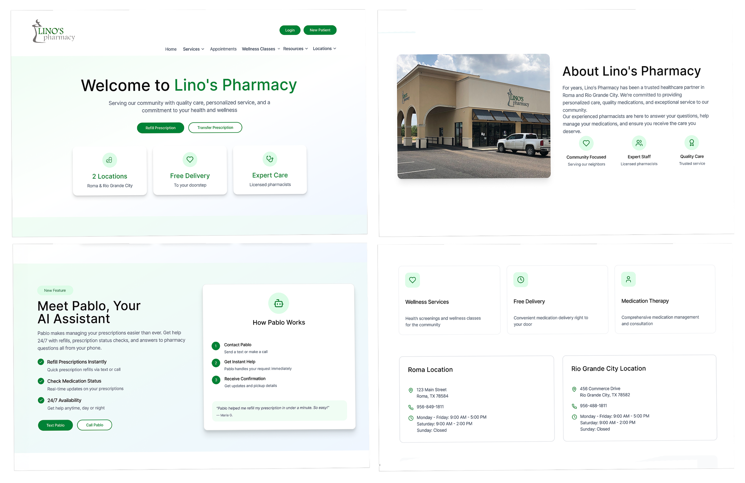
Lino’s Pharmacy is a community pharmacy located in Roma and Rio Grande City, Texas. On my initial visit to their website, one thing was very apparent: The actions I thought patients would need most - filling a prescription, checking if their medication was ready, or contacting the pharmacy- felt hard to navigate to.
Lino’s already had Pablo, a HIPPA-compliant assistant created to help patients with routine pharmacy tasks over text or phone call. My job was not to build Pablo. My job was to figure out how Pablo could be better presented on their website so that patients could easily find it, know what tasks it could assist them with, and feel assured it would work.
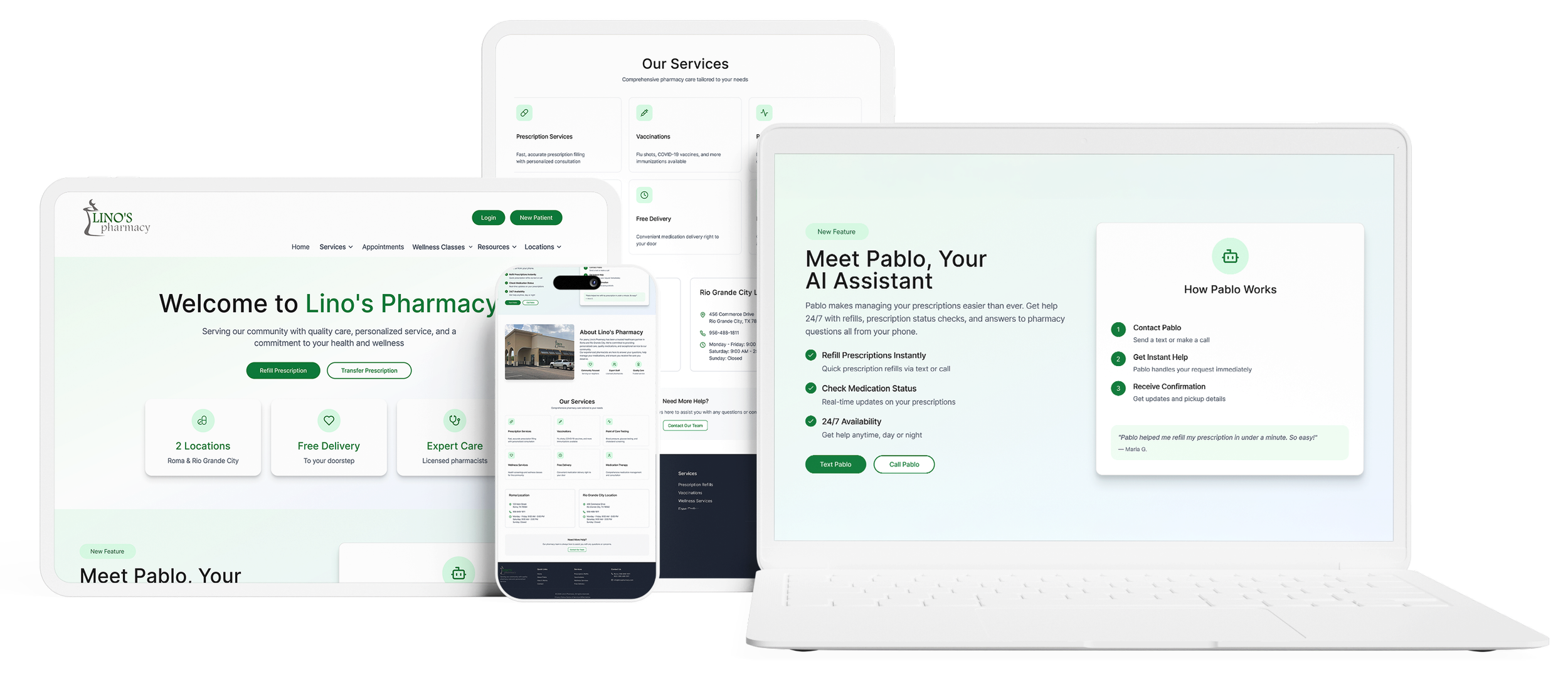
Meet Pablo - Lino’s AI assistant
The problem
Pablo existed. But the website wasn’t doing much to direct patients to it.
Common pharmacy tasks felt like they required extra work. There was no clear, intuitive doorway to show patients Pablo could solve their problems.
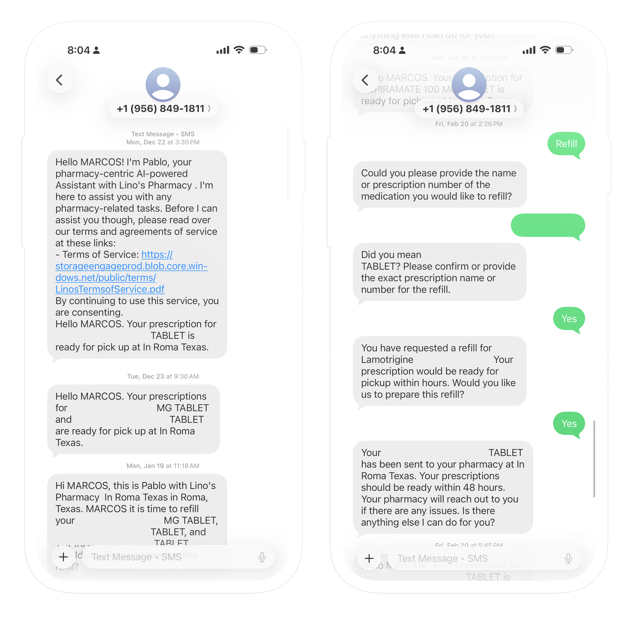
Submitting a refill prescription still involved multiple steps. More critically, patients had to realize that Pablo existed, what it did, and why they should use it rather than the traditional process.
The challenge became less about creating a new feature and more about crafting clarity, trust, and awareness around an existing one.
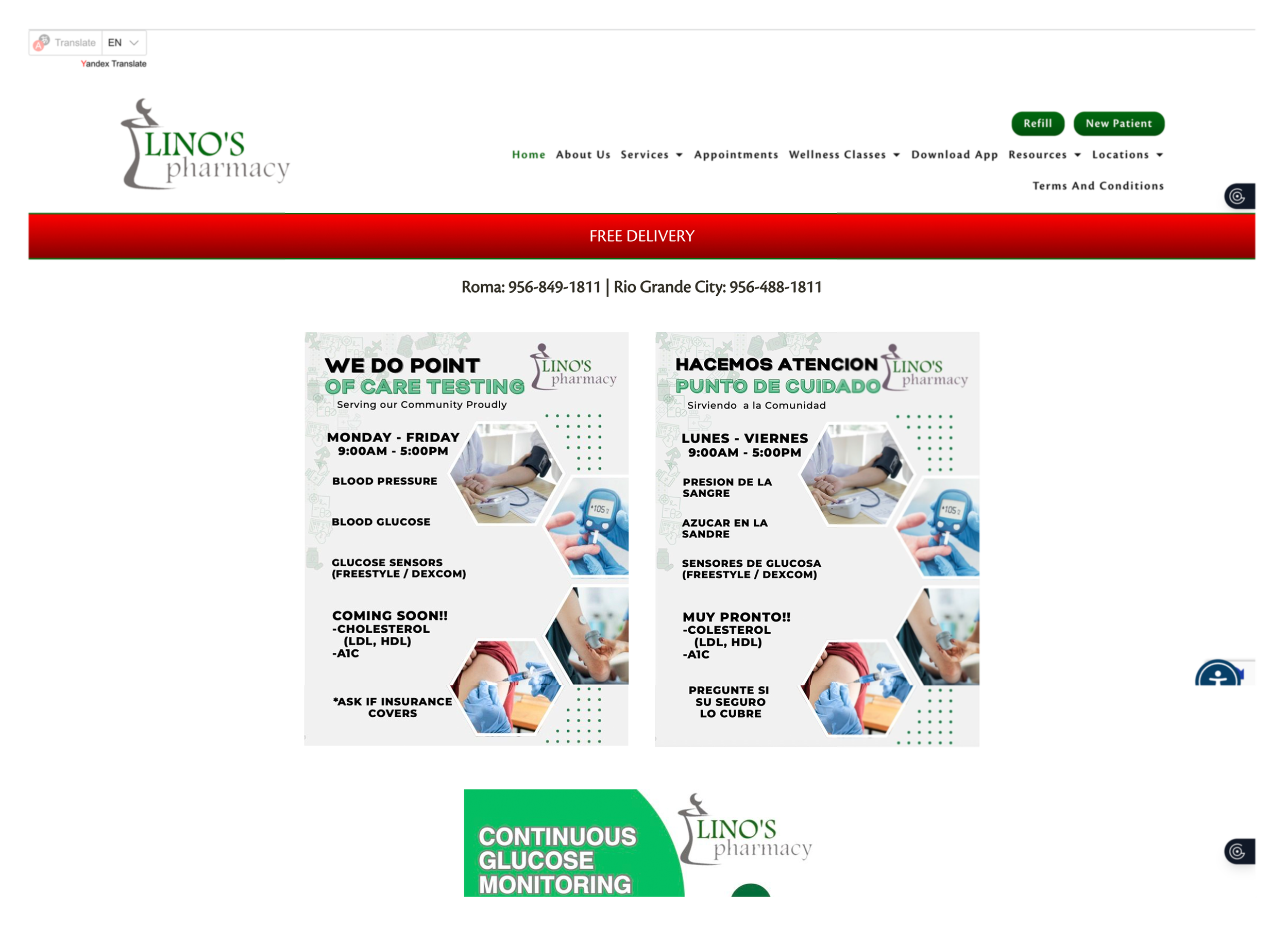
IIn order to refill/refill your medication you need to click on the button at the top of the page. From there you can also view the status of your medication ,although this is not clearly specified.
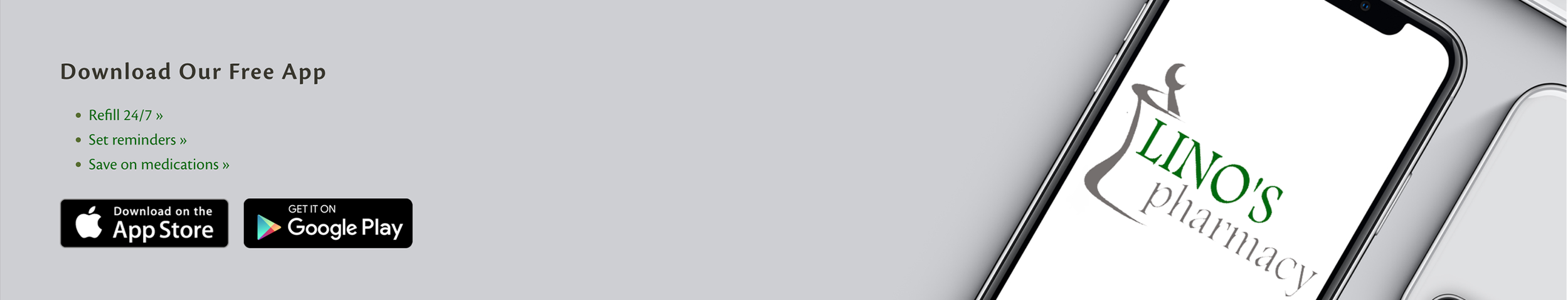
You can also download the app to check the status of your medication of refill it.
Interviews
I conducted interviews with 8 patients between the ages of 25-75 about their normal experiences with the pharmacy and what would make a tool such as Pablo feel accessible and useful.
Some were comfortable with websites and digital tools. Some were still old school and preferred to call, use the drive through, or walk in. Despite the variance in customer behavior, one thing remained true: The path of least resistance to complete common tasks.
I realized that acquisition wasn’t enough, sure they would try a cool tool if it was helpful. But how do you make something feel familiar? Obvious? Worth trying?
“Es mas facil ir a la farmacia (It’s easier to go to the pharmacy”
“I used other apps when my meds are not available here, I’m used to them, way more convenient”
“Of course I would use a feauture like that.”
“I’m always running, I need something faster than the drive-through, they take forever sometimes.”
“It’s a problem when I am having a bad day, and they are having a bad day and the call turns ugly, and I just have to ask for my meds.”
“Ya estoy vieja para apps (I’m old for apps)”
The opportunity
With that reframed, the project suddenly had much more intentionality.
The goal wasn’t to design the pharmacy experience around Pablo. It was to design Pablo into the website experience.
Which required as simply and clearly as possible answering:
Who is Pablo?
What can Pablo do for me?
When should I use Pablo?
Should I text or call Pablo?
Rather than hiding Pablo as another tool on the website, I made Pablo the simpler entry point for common tasks.
Designing the integration
The biggest challenge was making Pablo feel simple and approachable without overexplaining it.
I focused on a few things:
Introducing Pablo earlier in the flow
tying it to actions patients were already there to do
using simple language
providing 2 very familiar actions: Text Pablo, Call Pablo
That changed the website from functioning solely as an information layer to a more defined pathway toward an existing service.
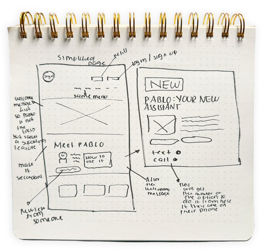
Sketches
I began ideating and sketching out my concept. I knew I wanted something simplistic. Some research feedback I received from my older user's was that they saw themselves as "too old" to use websites/apps. I wanted this to be as simple as possible for them.
However, at the same time I knew Pablo was not meant to be the forefront of the pharmacy. Pablo was a supplementary tool. So I kept that in mind.
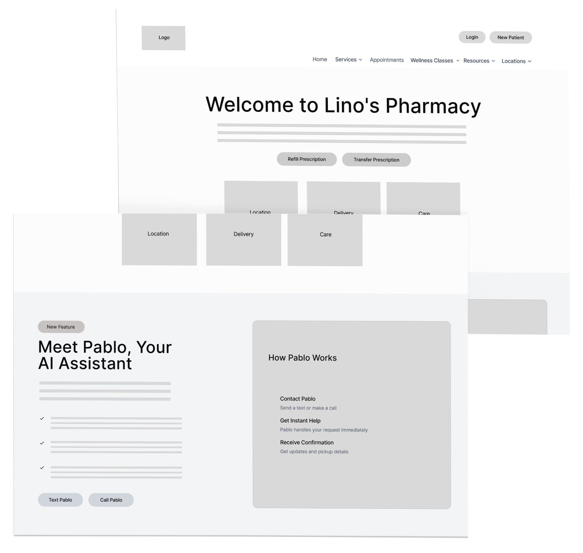
Mid-fidelity wireframes
Once I sketched out what I had in mind, I got started with my mid-fidelity wires. I needed to digitize my sketches
Final solution
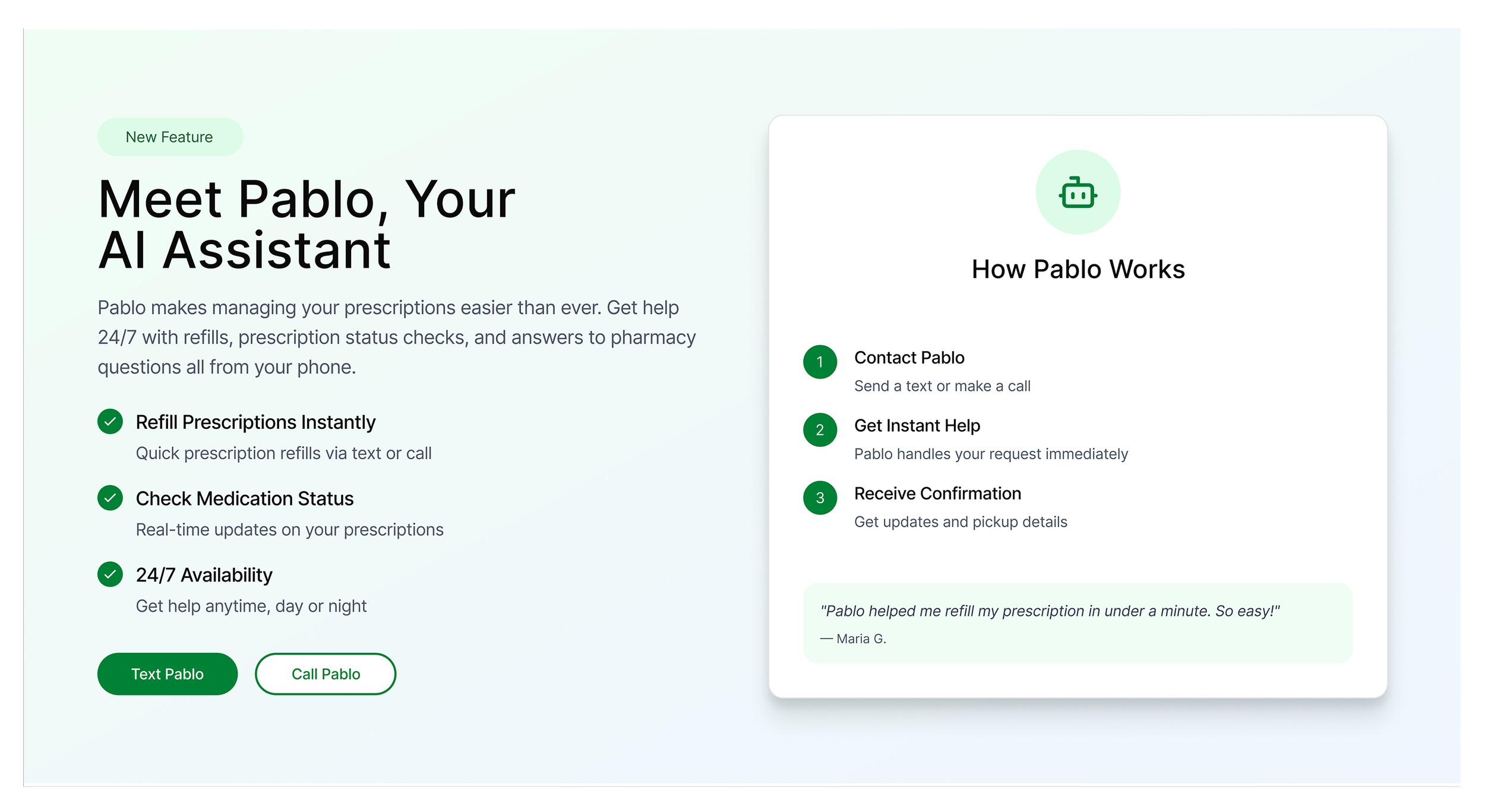
The final design integrates Pablo more directly into the website experience by making it easier to find, easier to understand, and easier to use.
A few decisions shaped the final direction:
Pablo is tied to real patient tasks
Instead of describing it in abstract terms, the design connects Pablo to common needs like refills, medication status, and pharmacy questions.
The entry points are clearer
Texting or calling Pablo is surfaced more directly, so patients do not have to guess how to begin.
The language is simpler
The messaging focuses on what patients can do, not on technical explanations.
The interaction feels familiar
Because Pablo works through text and phone, the experience aligns with behaviors many patients already trust.
Early validation
I validated the direction updated to see if users had a better understanding of what Pablo was and how to operate it. With early validation I saw that 70% of users found the directions on how to use Pablo and successfully texted Pablo or made a call.
The only participants that struggled with getting into the website and completing the task were some of the older users who said phrases like “Ya estoy muy viejo para estas cosas (I’m too old for things like this)” and “Necesitaria practicar mas (I would need to practice more).
Comments I got from users once they got better at it: “Si le entiendo a Facebook esto tambien puedo (If I learned Facebook, I can learn too).”
These results prove that the integration helped users understand Pablo better. But there was still work to do in order to make the onboarding process that much clearer.
The users were presented with two tasks:
1. Navigate to the website and locate the banner that tells you how to operate Pablo.
2. Complete the steps and check your medication status or place an order.
Reflection
This project taught me that having a useful tool and having a seamless experience are two different things.
Pablo already existed. I just needed to ensure that users could find it, understand it, and know when to use it. The goal wasn’t creating adoption for a shiny new thing. It was designing adoption for a valuable product that already existed.
It was important to design with different users in mind as well. It’s always important to keep in mind all kinds of users and this project was a good reminder of that.