
Linos Pharmacy:
Pablo: Making Pablo easier to discover and use
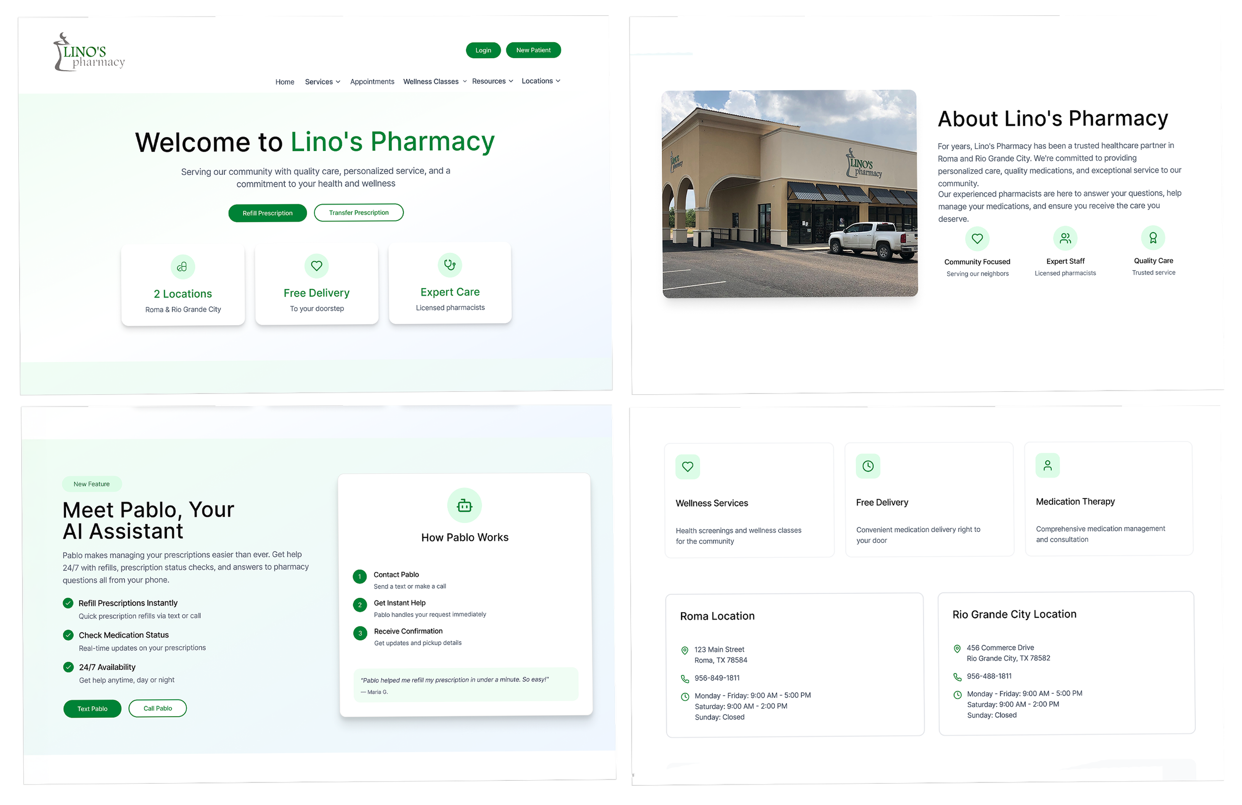
Lino’s Pharmacy is a community pharmacy serving Roma and Rio Grande City, Texas. When I first visited the website, one thing stood out right away: what patients need to do to fill a prescription, check whether the medication was ready, or contact the pharmacy. It did not feel easy to find or navigate.
Role: Freelance Product Designer
Scope: Research, UX/UI design, wireframing, prototyping, early validation
Timeline: 4 weeks
Team: pharmacy stakeholders
Platform: Website experience
Outcome at a glance
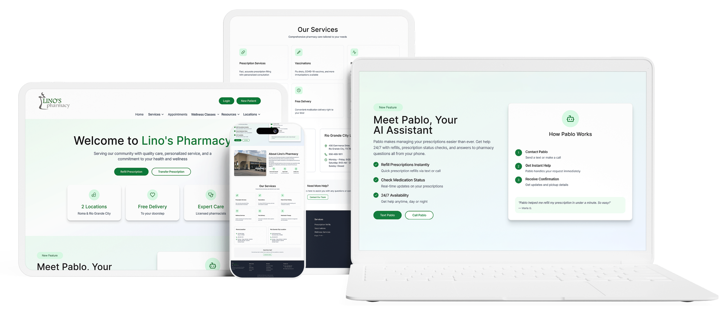
The redesign focused on making Pablo easier to find, easier to understand, and easier to use for common pharmacy tasks. Instead of treating Pablo as just another feature on Lino’s site, the goal was to make it feel like a clear, approachable starting point for patients who needed help quickly.
In early validation, 70% of users were able to find the instructions for Pablo and successfully text or call it to complete a pharmacy-related task. The users who struggled most were some older participants who felt less comfortable with websites and apps, which highlighted the need for even clearer onboarding and guidance.
Meet Pablo
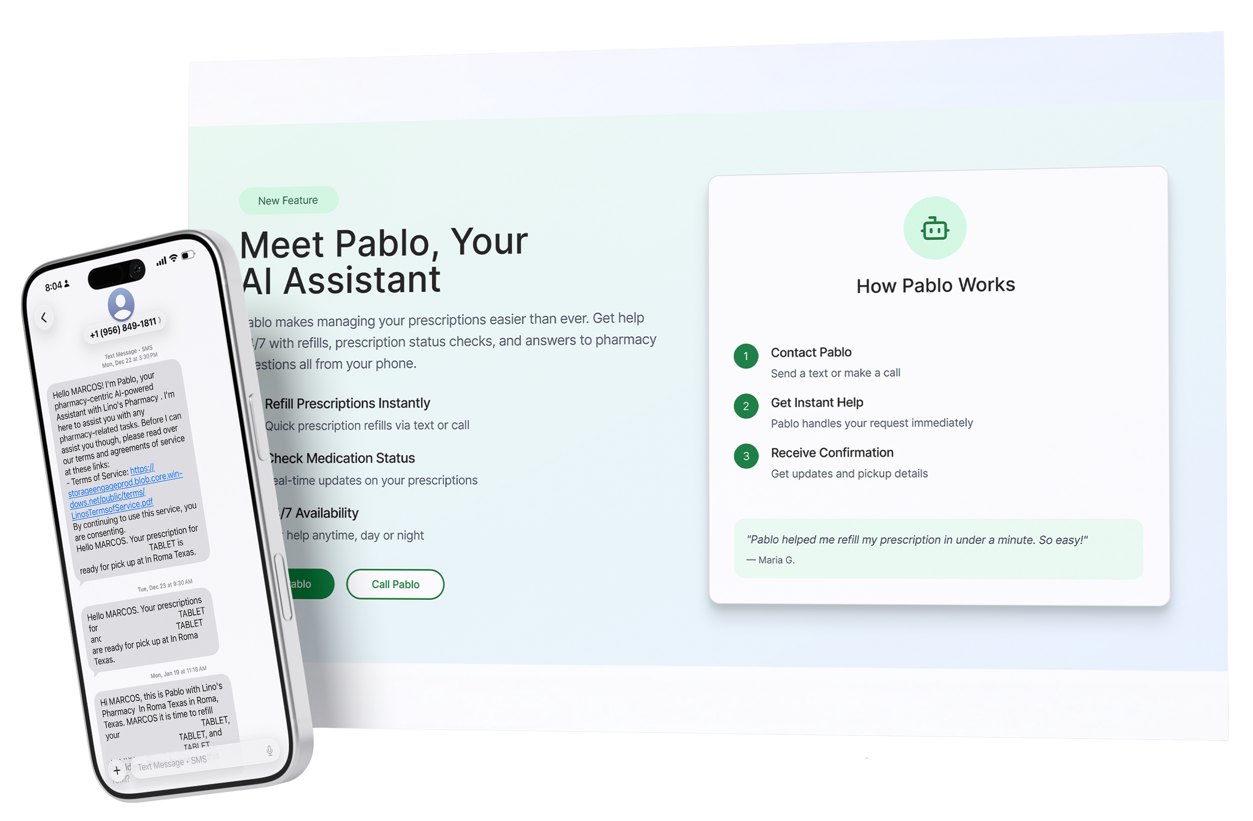
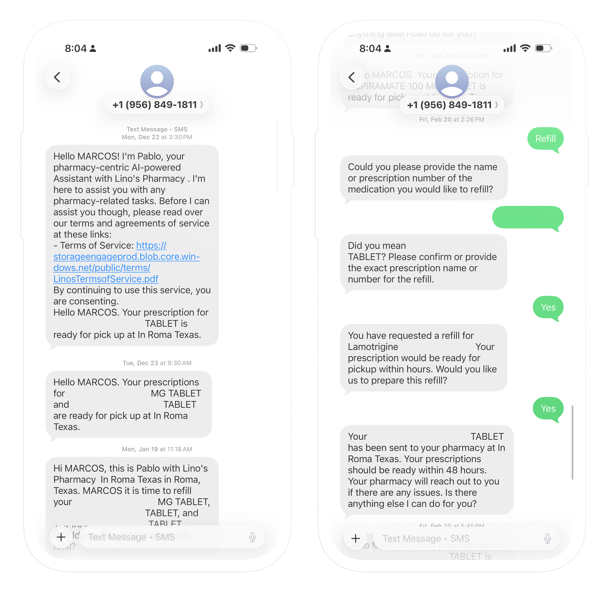
Lino’s already had Pablo, a HIPAA-compliant assistant designed to help patients with routine pharmacy tasks through text or phone. My role was not to build Pablo itself, but to think through how Pablo could be introduced more easily on the website so patients could find it, understand what it could help with, and feel confident using it.
The problem
Pablo already existed, but the website was not doing enough to guide patients to use it. As a matter of fact, up to that point, the only way Pablo was being advertised was by word of mouth.
Common pharmacy tasks still felt like they required extra effort, and there was no clear or intuitive entry point showing patients that Pablo could help them solve those problems.
That made the challenge less about designing a new feature and more about creating clarity, trust, and awareness around an existing one. Patients first had to realize Pablo was there, understand what it could do, and feel confident choosing it over more traditional paths like calling, driving through, or walking in.
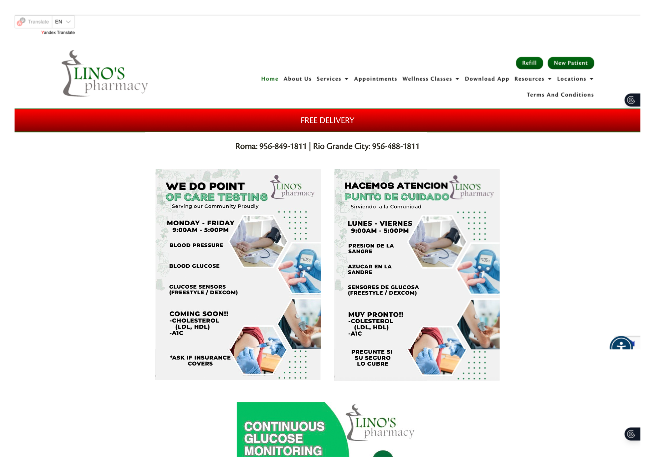
In order to refill your medication you need to click on the button at the top of the page. From there you can also view the status of your medication ,although this is not clearly specified.
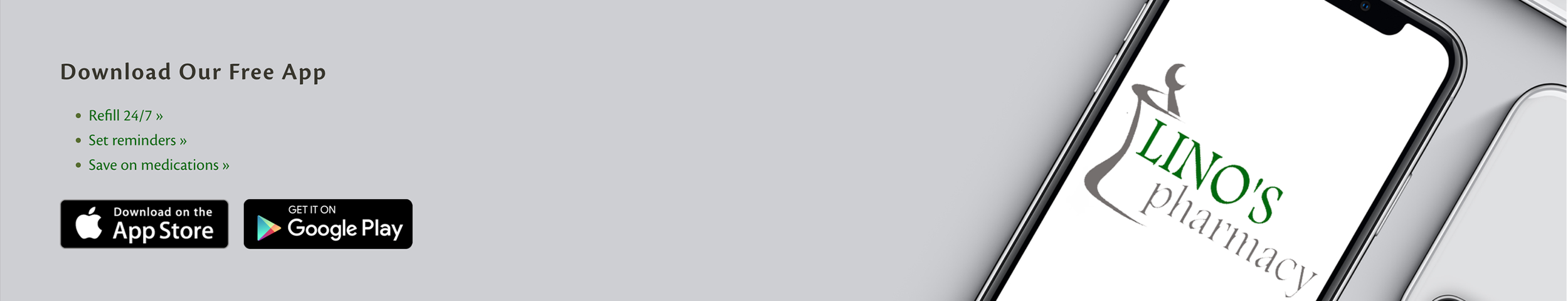
Users could also download the app to check medication status or refill a prescription, but that path was not especially clear either.
My role
I led the UX process from research through early validation.
My role included:
Reviewing the existing website experience
Identifying friction in common patient tasks
Speaking with patients, translating those insights into design direction
Creating sketches, wireframes, and final designs to make Pablo easier to find and understand within the site.
Research
Even with that range of behaviors, one theme stayed consistent: people wanted the easiest thing when handling routine pharmacy tasks. Convenience mattered, but familiarity, trust, and confidence mattered just as much.
“Es mas facil ir a la farmacia (It’s easier to go to the pharmacy”
“I used other apps when my meds are not available here, I’m used to them, way more convenient.”
“Of course I would use a feauture like that.”
“I’m always running, I need something faster than the drive-through, they take forever sometimes.”
“It’s a problem when I am having a bad day, and they are having a bad day, and the call turns ugly, and I just have to ask for my meds.”
“Ya estoy vieja para apps (I’m old for apps)”
Key insights
Familiarity matters as much as functionality
Patients were open to using Pablo, but adoption depended on it feeling simple, obvious, and familiar enough to trust. In this case, the challenge was making Pablo feel approachable for people with different levels of digital comfort.
Patients want speed, but not complexity
Participants wanted something faster than calling or using the drive-through, but they were not looking for a complicated digital workflow. However, they did mention they already knew the pharmacists, so familiarity mattered to them too.
Older users needed extra clarity and reassurance
Some older participants described themselves as “too old” for apps or websites, which meant the design needed to be as easy as possible for them.
The opportunity
Once the problem was reframed, the design direction became much clearer. The goal was not to redesign the pharmacy experience around Pablo, but to add Pablo to the website in a way that felt natural, useful, and easy to approach.
That meant answering a few simple but important questions as clearly as possible:
Who is Pablo?
What can Pablo help me do?
When should I use Pablo?
Should I text or call Pablo?
Instead of letting Pablo sit in the background as just another tool, the opportunity was to make it a clearer and easier-to-find entry point for common patient needs.
Exploration
I began by sketching different ways Pablo could be introduced more clearly into the website experience. I wanted the interaction to feel simple and approachable, especially for users who already felt hesitant about websites or apps. At the same time, I knew Pablo was meant to support the pharmacy experience, not overpower it, so the integration had to feel visible without taking over the entire site.
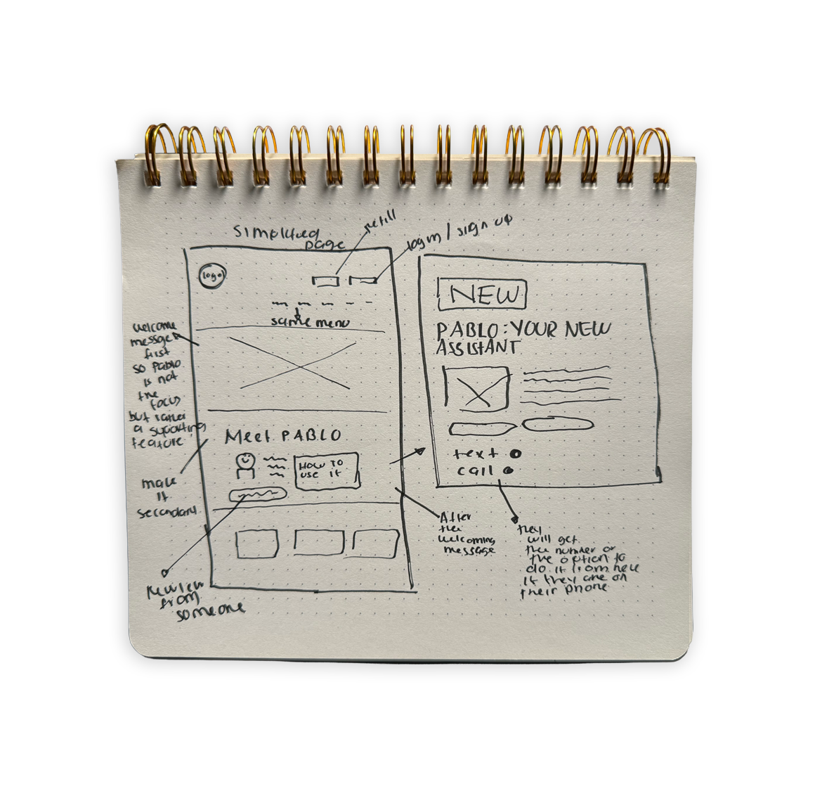
Wireframes and interaction design
After exploring the concept through sketches, I moved into mid-fidelity wireframes to clarify placement, messaging, and task flow. The goal at this stage was to make Pablo easier to notice, easier to understand, and easier to act on without overexplaining it.
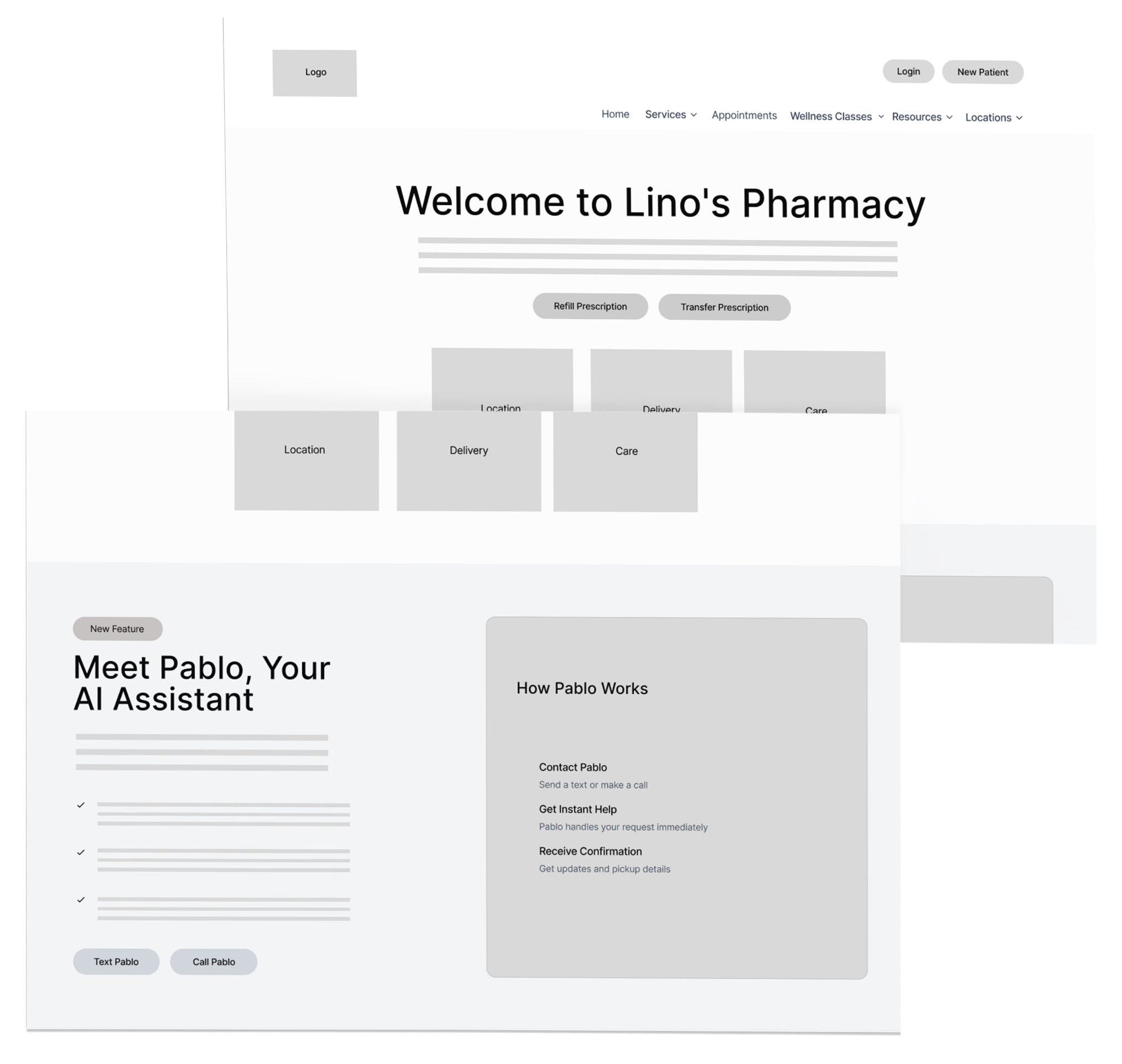
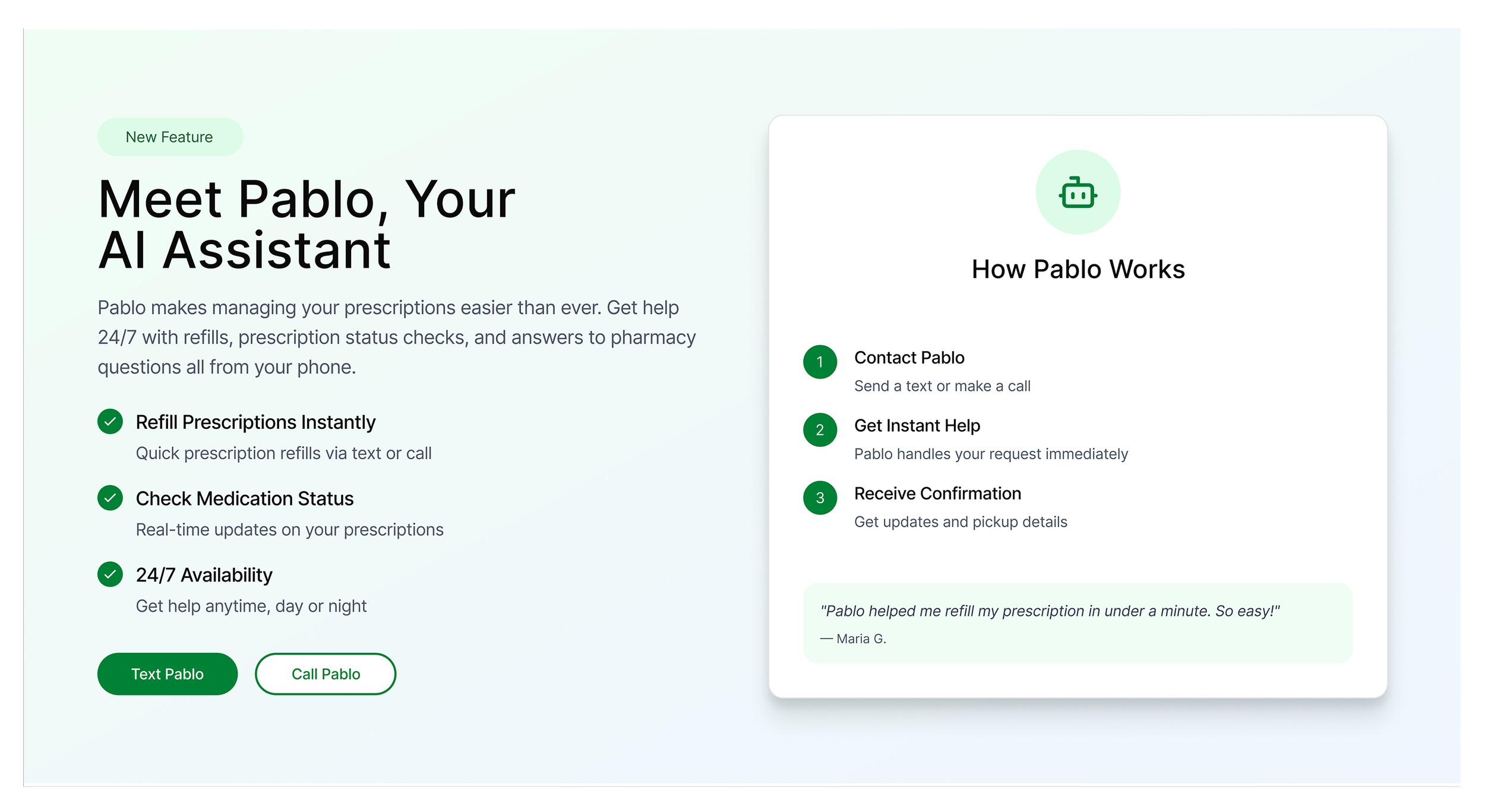
Final solution
The final design brought Pablo more clearly into the website by making it easier to find, understand, and use. Rather than showing Pablo in vague terms, the design connected it to real user’s needs like refills, medication status, and pharmacy questions.
A few decisions helped me take the final decision:
Pablo is connected to real users tasks
Instead of framing Pablo as another AI assistant, the experience ties it directly to the common reasons patients come to the site.
The entry points are clearer
Texting or calling Pablo is shown more prominently, so patients do not have to wonder where to begin.
The language is simpler
The messaging focuses on what patients can do with Pablo rather than on explaining the technology behind it.
The interaction feels familiar
Because Pablo works through text and phone, the experience is built on behaviors many patients already know and trust getting rid of hesitation.
Early validation
I did some early validation to understand if users knew what Pablo was, how to use it, and where to start. During testing, 70% of users found where Pablo’s directions were located and successfully texted/called Pablo to complete a task.
Users who struggled the most were some of our older users who already didn’t feel comfortable navigating websites or apps. This validated that the redesign communicated better, but also indicated that onboarding/guidance needed to do more to support less-confident users.
Tasks:
Navigate to website and locate where to find instructions on using Pablo.
Follow the instructions to check your medication status/place an order.
Impact
With this project Pablo went from feeling like a hidden feature that's always existed to something more clearly rooted in the pharmacy experience. Awareness improved, customers better understood how Pablo could assist them, and the overall journey of using Pablo felt more straightforward and inviting.
Most importantly, I learned that adoption doesn’t rely only on the presence of a helpful tool. It's also about how clearly that tool is signaled, explained, and tied to users' pain points.
What I’d explore next
If the project continued, I would want to explore:
Stronger onboarding for older or less digitally confident users
Clearer guidance around when to text versus call Pablo
More visible cues tied to common pharmacy tasks like refills and status checks
Additional validation with a broader range of users
Post-launch measurement to understand whether awareness and task completion continue to improve over time
Reflection
Pablo also reminded me that good design has to meet people where they are. In this case, that meant thinking carefully about different comfort levels with technology and designing an experience that felt simpler, more familiar, and more supportive from the start.