

Noah’s Ark:
Redesigning a lost-pet recovery app for urgency, clarity, and emotional support
Noah’s Ark is a lost-pet recovery app built to help pet owners take action when a pet goes missing. Over time, reporting tools, pet profiles, community feed, and other features were combined into one experience. As more features were added, the app’s most urgent flows began to lose importance, with main actions competing against secondary content and unclear priorities.
Role: Freelance Product Designer
Timeline: 6 weeks
Scope: UX audit, user research, interaction design, wireframing, prototyping, usability testing
Team: founder, developers, copy designer
Platform: Mobile app
Outcome at a glance
The redesign focused on making urgent actions easier to find, simplifying the reporting experience, and creating a tone that felt more supportive in a stressful moment.
Moderated prototype testing with 5 participants showed:
Task completion increased from 60% to 100%
Average completion time decreased from 4m 20s to 2m 30s
Participants’ confidence increased from 4.1 to 6.3 on a 7-point scale
The problem
When someone loses a pet, they do not need every feature the app offers. They need clarity, urgency, and a clear next step.
In Noah’s Ark’s case, reporting a lost or found pet was buried among donation buttons, store content, and community features. The product had good intentions, and their heart was in the right place! However, the experience did not reflect what users actually needed in that moment.
This was not just a visual problem. It was a product-priority problem.
My role
I led the UX process from audit through validation. My role included:
Reviewing the current product experience
Identifying friction in the most important user flows
Conducting interviews with pet owners
Turning research into design principles
Creating sketches, wireframes, and prototypes
Testing the redesign with users
I also collaborated with the copy designer, founder, and developer to refine the experience's tone and ensure the new design and direction stayed grounded in both user needs and product realities. I wanted to make sure we humanized and simplified the app at the end.
Understanding the current experience
I started with a walkthrough of the app’s most important flows:
Report a missing pet
Report a found pet
Create and manage a pet profile
With those core flows, I also looked at how secondary systems such as social feed, donations, monetization, memorial features, and gamification shaped the reporting experience.
Four problems stood out:
1. Critical actions were competing with less important features
Urgent actions were competing visually and structurally with secondary features. In a moment of panic and anxiety, that kind of competition creates hesitation, confusion, and unwanted stress.
2. The product structure did not match the user’s mindset
The app was made like a platform with many features, but users in a crisis are not thinking that way. They need reassurance, clarity, and a quick path to action. Not a social media feed or a paywall.
3. The tone felt too harsh in key moments
Some of the language felt cold in places where users needed calm and reassurance. It may seem like a small detail, but it has a real impact on how supported the experience feels.
4. The reporting process felt too burdensome
Submitting a report felt longer, heavier, and more repetitive than it needed to be. In stressful situations, users need simplicity and a sense of forward momentum. They need support.
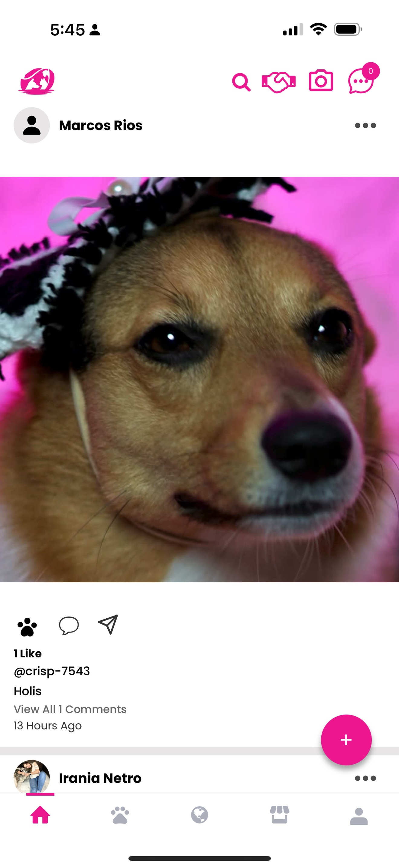
Social-media-style landing feed
The navigation felt more like a social feature, like Instagram, than a crisis-first experience
The landing experience encouraged browsing instead of immediate action. Users don’t need to like pictures.
Social feed patterns competed with recovery-focused tasks
There was no clear visual path to report a missing pet right away
The home screen prioritized engagement before urgency
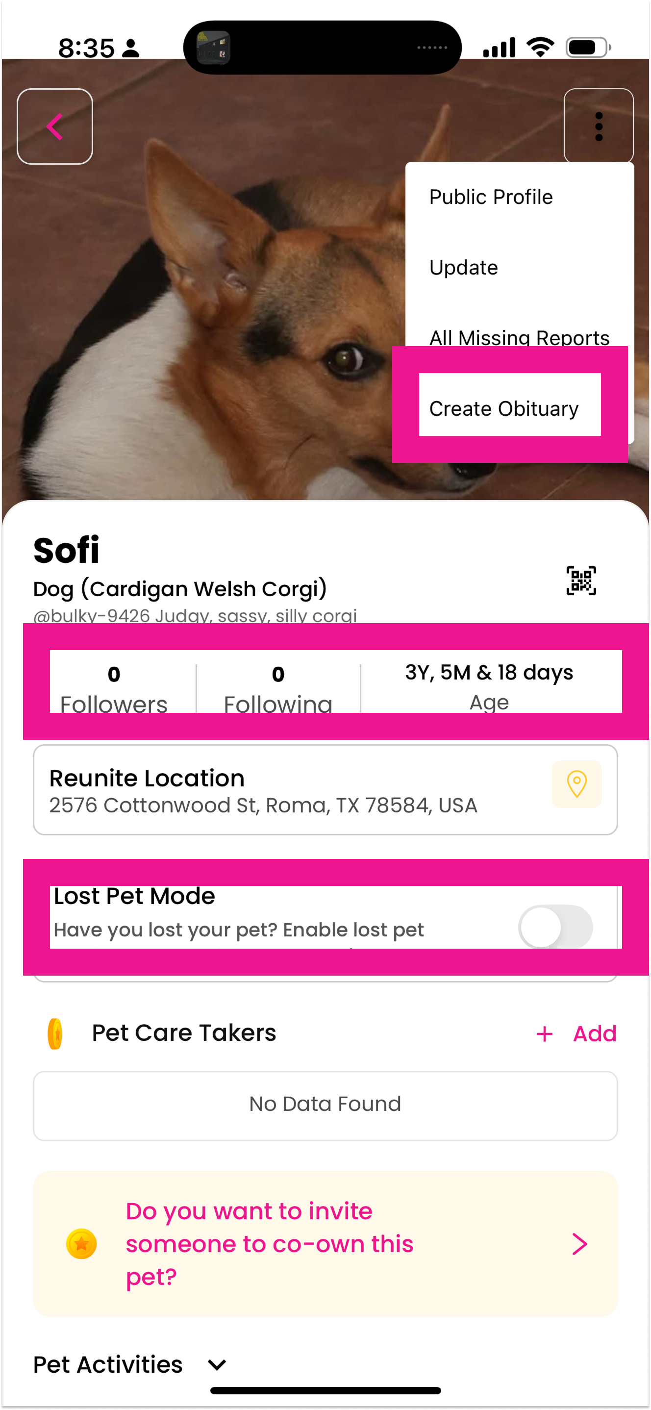
Pet profile
Memorial creation placed within an active search context: Blurs the boundary between recovery and loss.
Competing Mental Models
Profile management and crisis tools are grouped together.
Redundant Navigation Paths: “Edit Flyer” is accessible elsewhere, too
Primary crisis action lacks visual priority
“Lost pet mode” vs “Followers and following” creates cognitive dissonance.”

Lost pet report
Monetization modal interrupts active crisis reporting flow.
Competing Primary Action
Point to “Fund Now” button
Visual emphasis shifts attention away from completion.
Emotional Mismatch
Marketing language during vulnerable moment
Transactional tone contrasts with emotional context.
Research
To validate the audit findings, I spoke with 5 participants I recruited from Facebook pet communities:
2 had lost a pet in the past
1 currently had a missing pet
1 had an unresolved loss
1 was a general pet owner
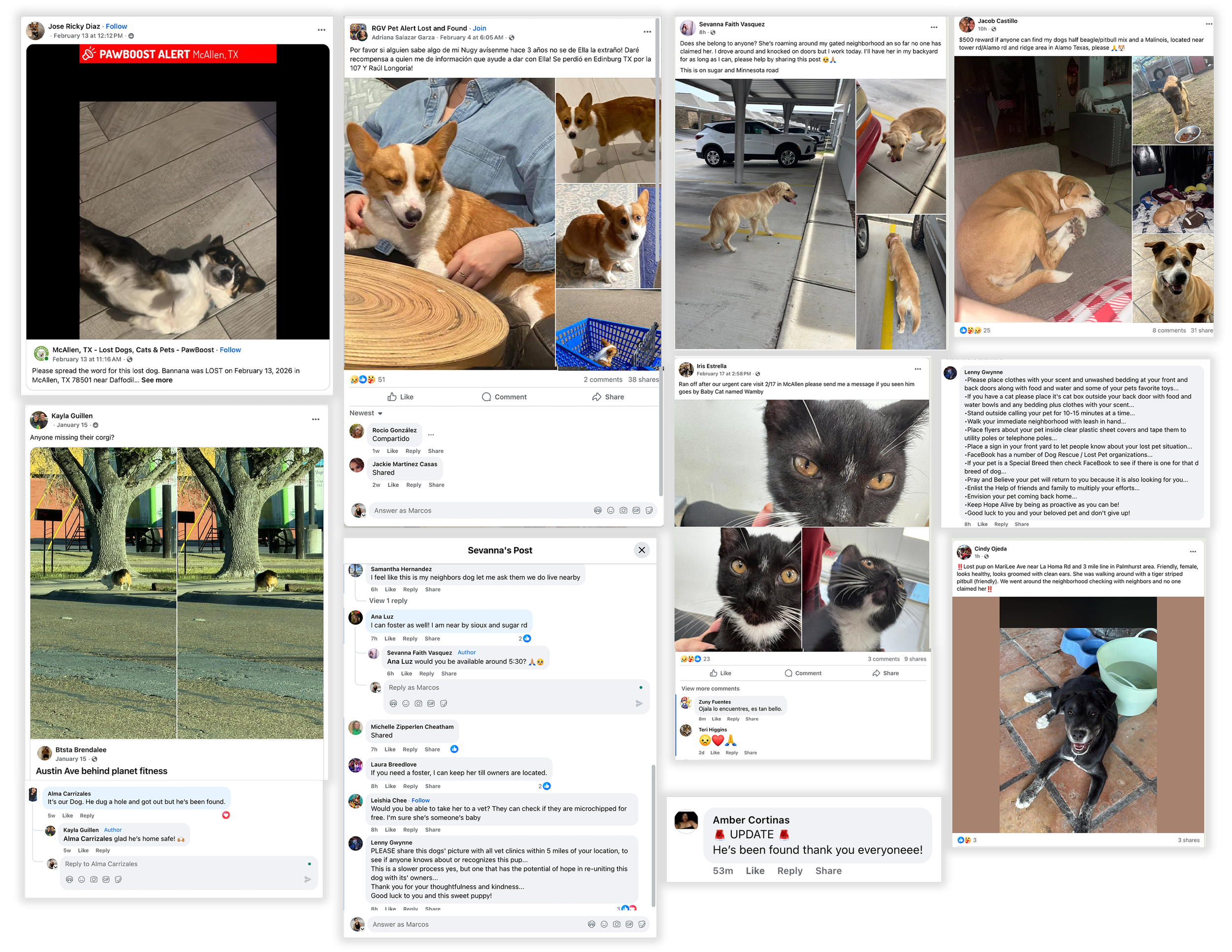
I also reviewed real lost-pet posts from community groups to better understand how people naturally communicate when they loose they beloved pet.
One problem became especially clear: crisis language like “Lost Pet Mode” was sitting next to social cues like “Followers” and “Following.” That contrast created cognitive dissonance, making the experience feel less aligned with the moment's importance.
Key insights
Stress amplifies every interaction
Participants found long forms, repetitive questions, and long experiences draining during what was already an emotionally taxing time.
“It feels like an interrogation.”
Design takeaway: Minimize steps, and help people feel like they are accomplishing something.
People need reassurance
Participants craved confirmations, clarity, and tone that would make them feel supported and certain rather than unsure.
“Did it actually submit?”
Design takeaway: Ensure clearer confirmation states, human-centered microcopy, and more robust feedback throughout the flow.
Real recovery behavior is speedy. Functional. Community-first.
We noticed the same patterns keep arising across real lost-pet posts:
Design principles
To guide the redesign, I used three principles:
1. Put urgent actions first
The most important tasks should be the easiest to find and complete.
2. Minimize the effort during anxiety-inducing times
In high-emotion moments, every extra question or unclear step feels heavier.
3. Design with empathy and the user in mind, not just efficiency
The product should not only work well. It should feel like it understands the user’s situation.
Exploration
I tried a few designs with sketches. I wanted to make sure to have a baseline that included:
A home experience around critical actions
A navigation
Reporting flows and guidance
Moving secondary features out of the critical path
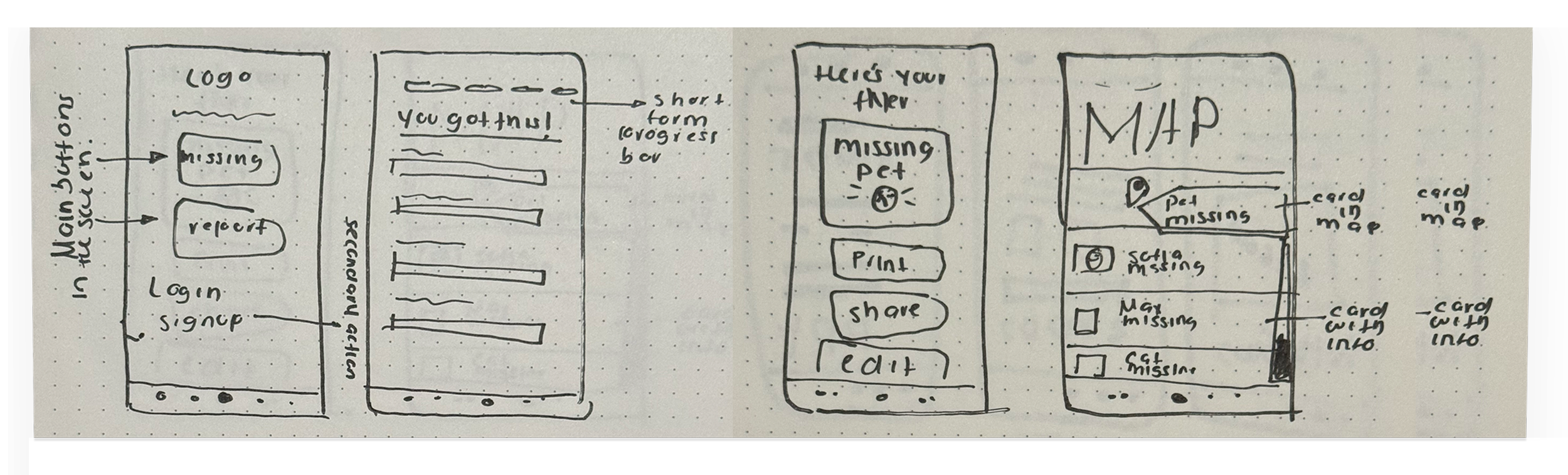
Wireframes and interaction design
I turned the strongest concepts into mid-fidelity wireframes:
Adding a visual step indicator to reduce ambiguity
Making required inputs easier to understand
Giving the location more importance in the reporting flow
Including a review step before submission
Improving confirmation states and guidance on what to do next
Designing a share-ready alert to support community visibility
After this, I went ahead and created my high-fidelity prototype and wireframes.
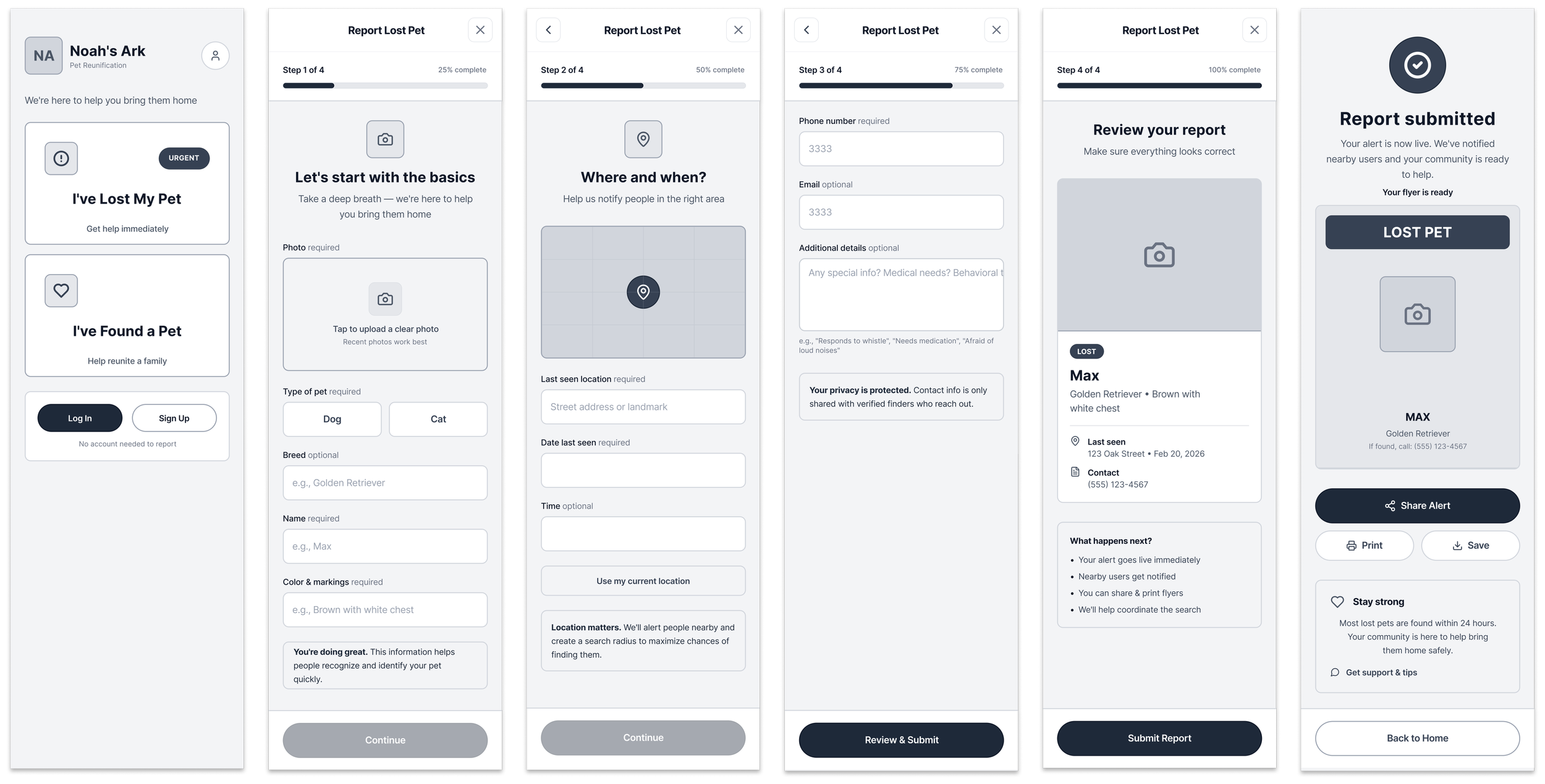
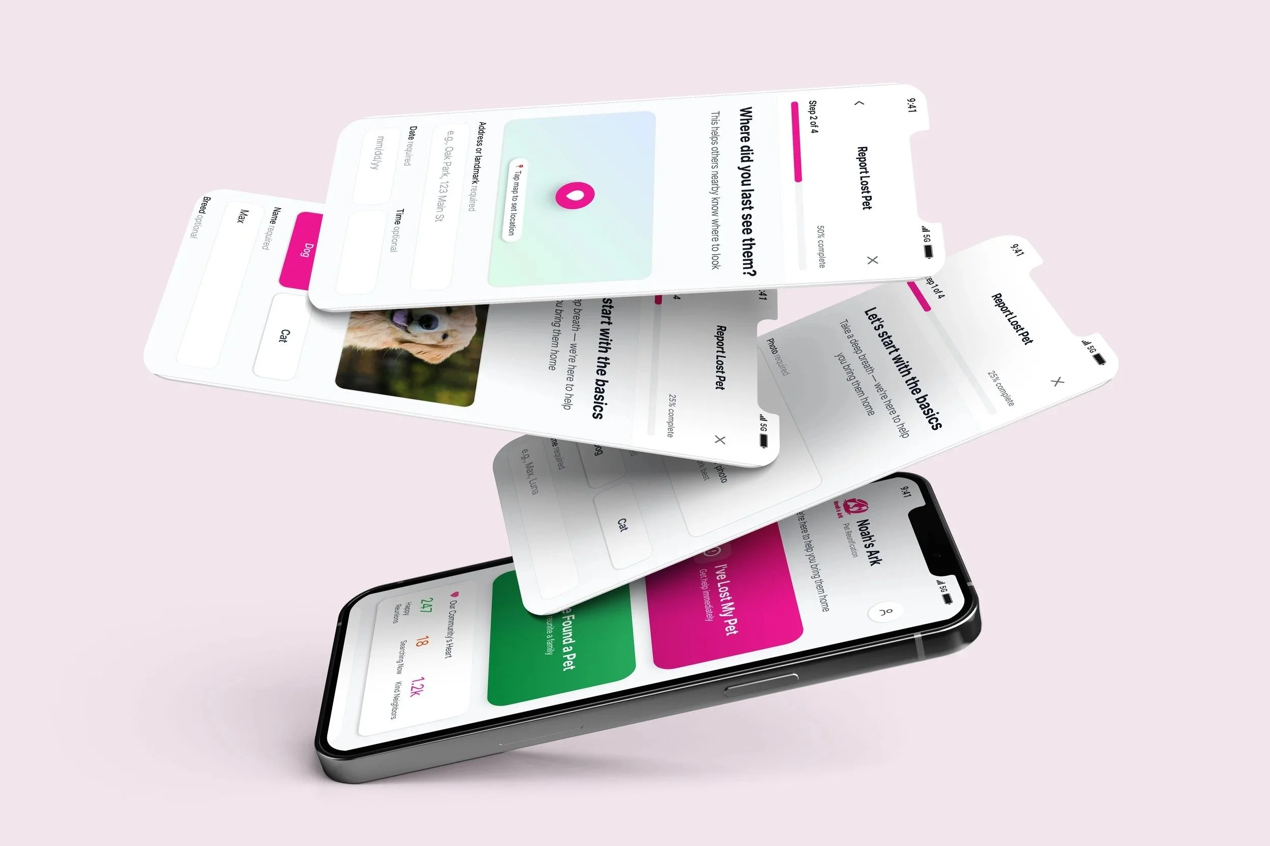
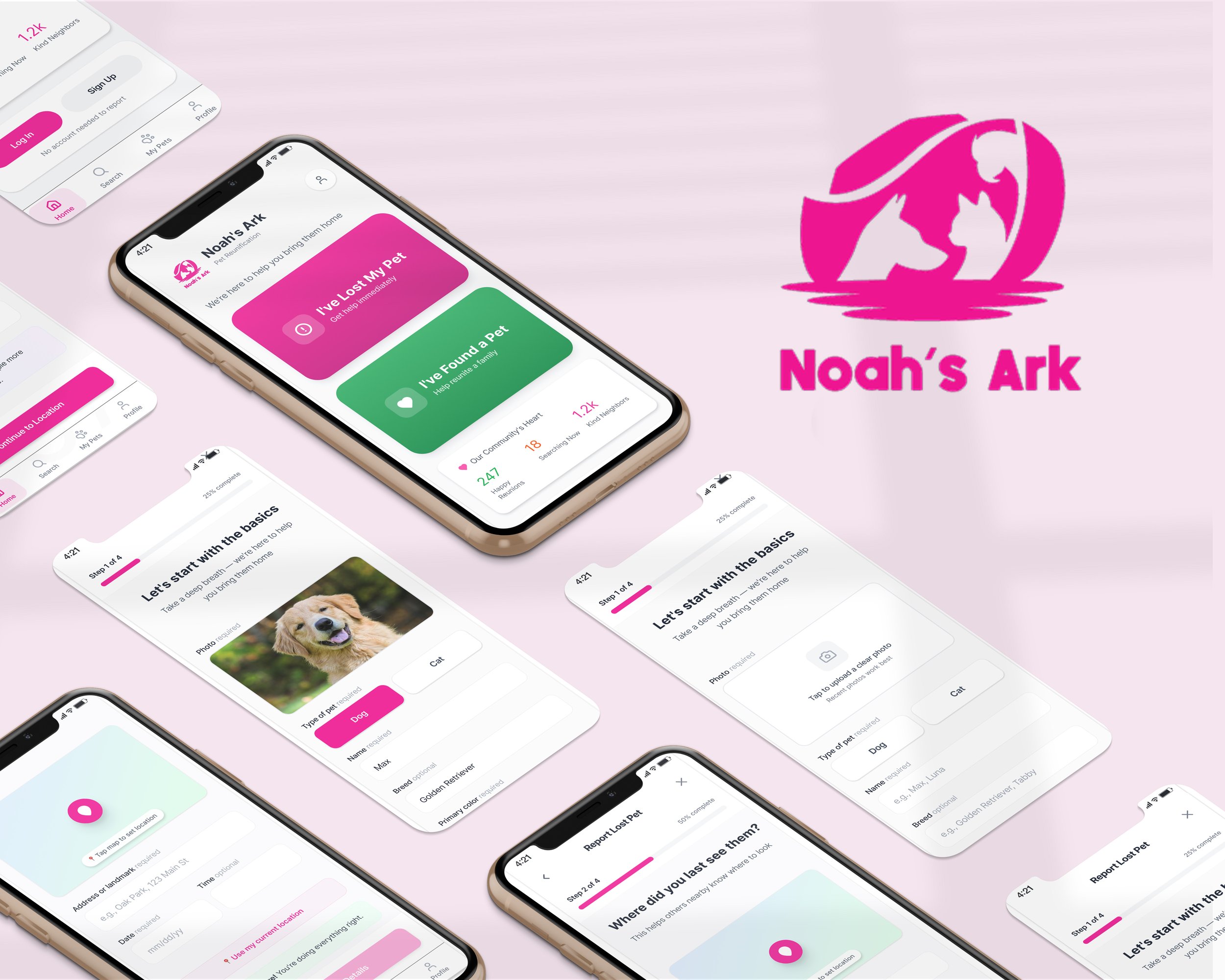
High fidelity + Key Changes
-
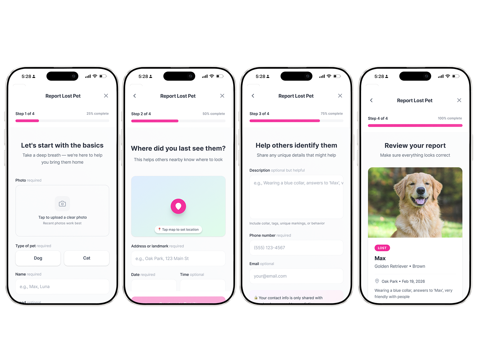
How owners report missing pets
The old way to report a missing/found pet was very long and repetitive. I made the new flow feel simpler, shorter, and more empathetic from the very beginning.
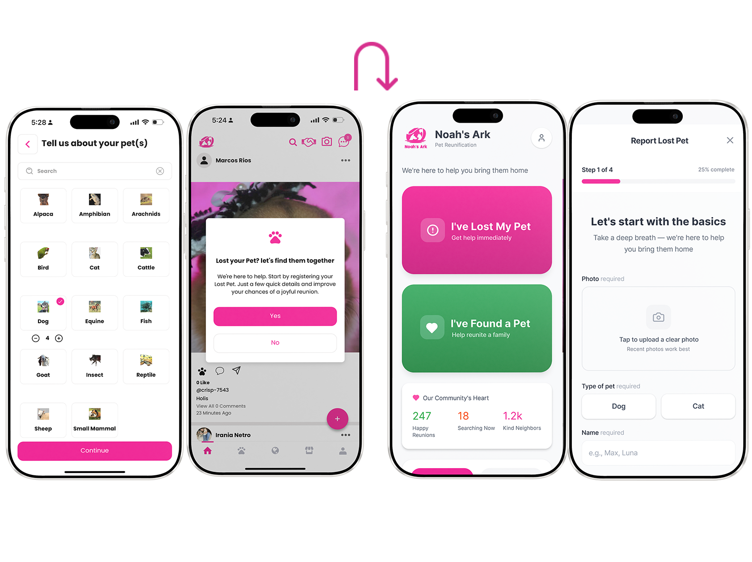
-
Guided, dramatically shorter reporting flow
Clear step indicators, required vs optional fields labeled plainly, progress bar, encouraging microcopy (“You’re doing great, just a couple more details to help bring them home”).
-
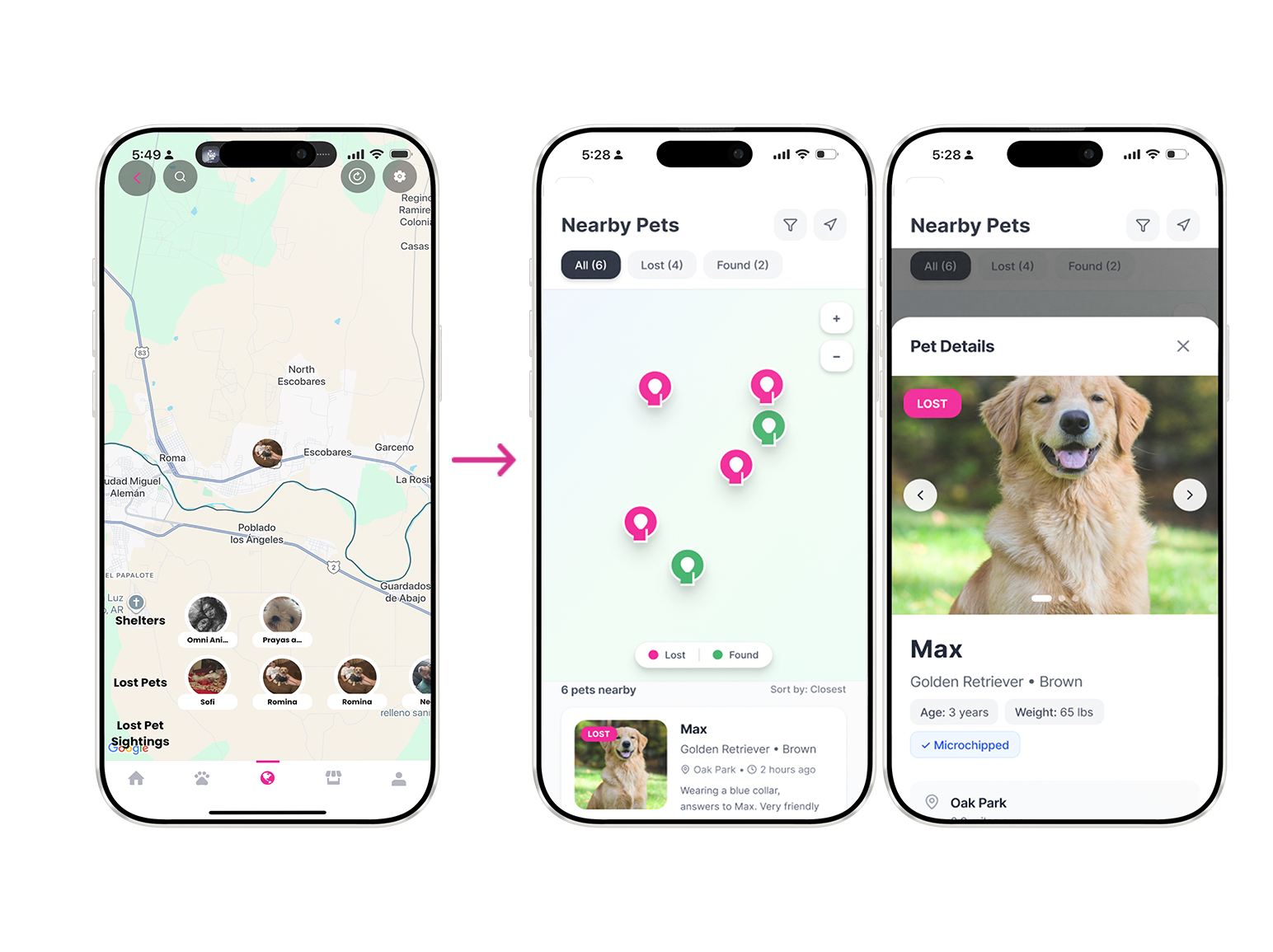
Map-centered lost/found search
Scannable cards with big photo + key info (location, time last seen, breed, contact snippet). No gamified swiping, just clean, glanceable posts like a neighborhood bulletin board
-
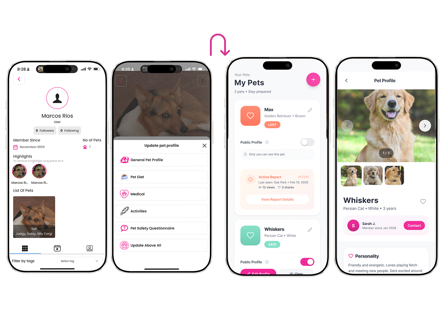
Simplified “My Pets” dashboard
One clear place to manage your animals, toggle lost status, see reports. Removed duplicate fields and confusing overlaps between pet profiles and user profiles.
-
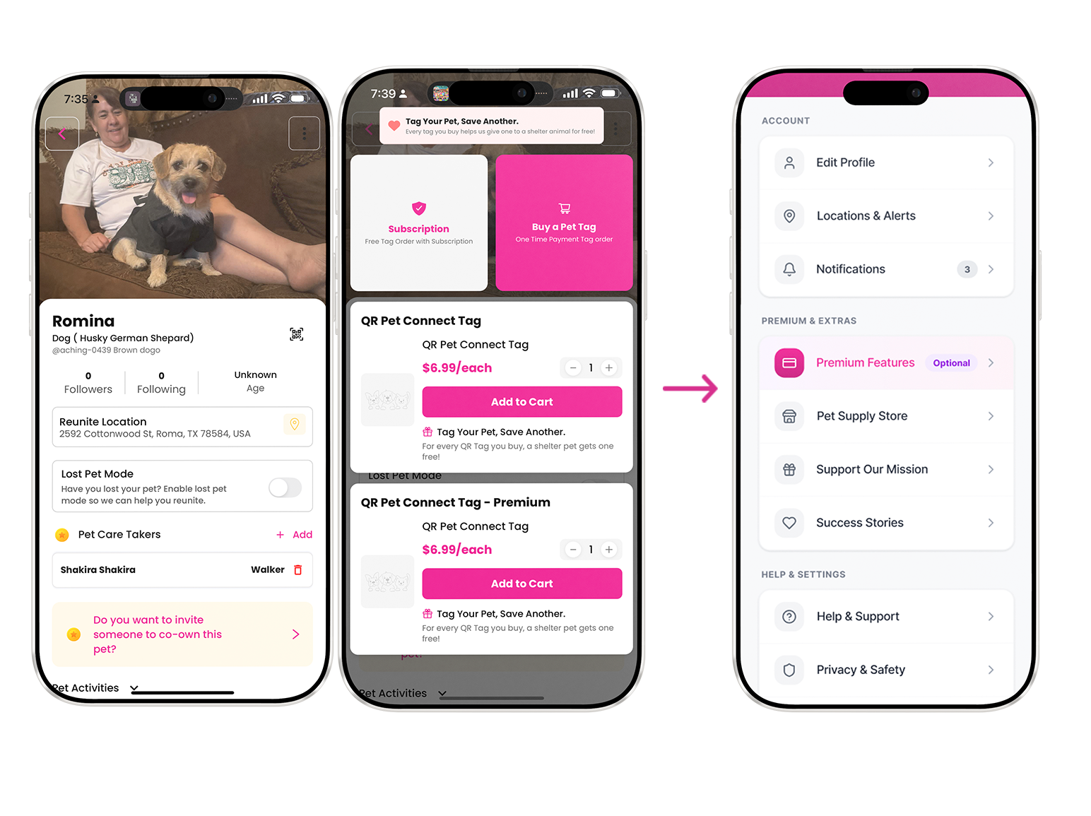
Monetization & membership moved off the critical path
Wallet, store, donations, premium features still exist , they’re just never interrupting the main lost/found flows. They live in secondary nav or post-reunion thank-you screens.
-
Humanized, supportive tone everywhere
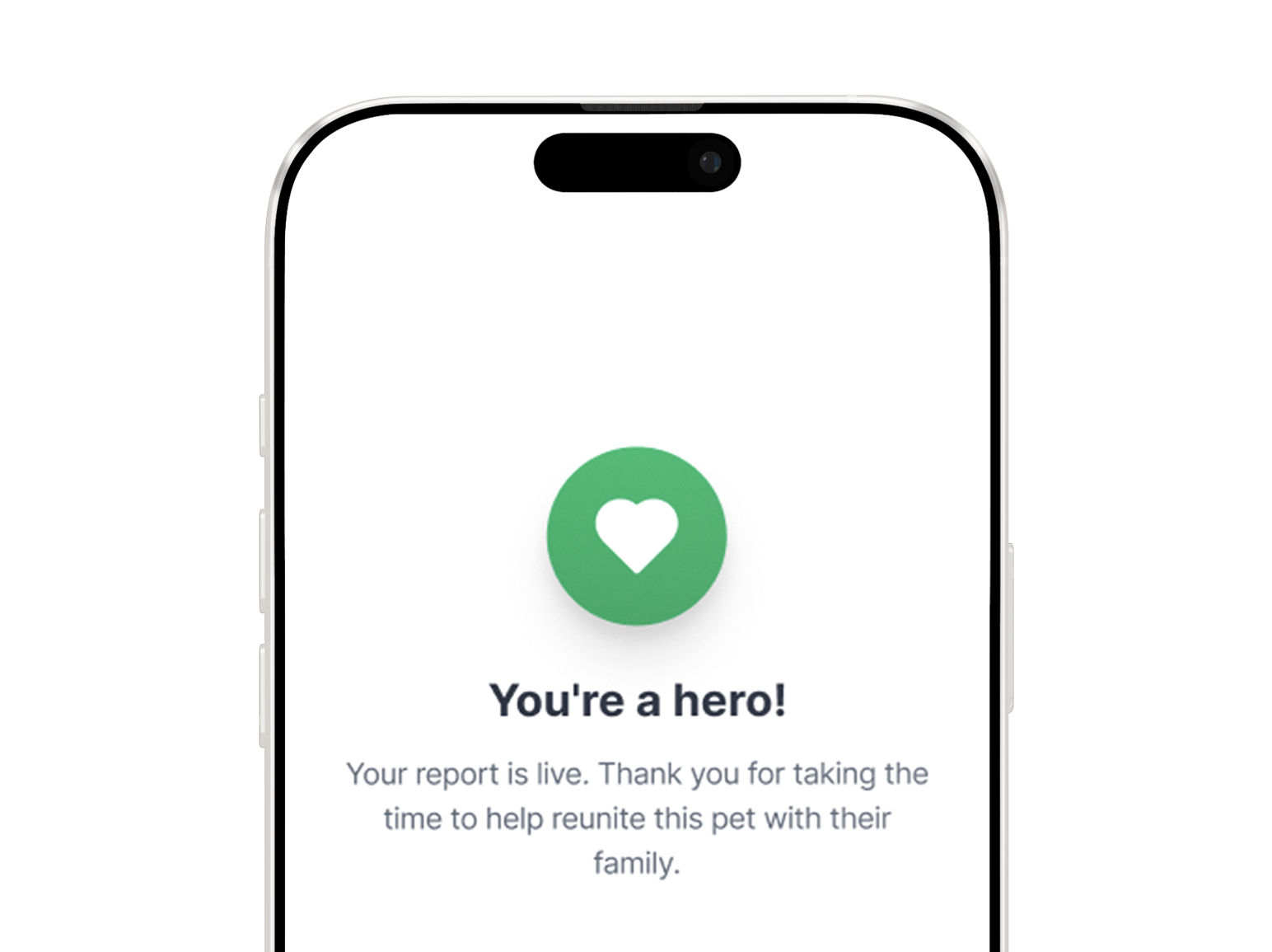
Swapped cold labels for supportive language such as: “We’re here to help you bring them home” “Take a deep breath let’s do this together, one step at a time” “Your report is live, thank you for trusting us with this” Confirmation screens now include small emotional reassurances instead of just “Submission received.
Report missing pet
Report found pet
Validation
I tested the redesign through moderated usability sessions, comparing the original flow with the redesigned prototype.
Tasks included:
Submitting a missing pet report
Submitting a found pet report
Findings
Task completion increased from 60% to 100%
Average completion time decreased from 4m 20s to 2m 30s
Confidence ratings increased from 4.1 to 6.3 out of 7
Qualitative takeaways
Participants advanced through the redesigned flow with confidence, asked fewer clarification questions, and described the experience as easier to understand and more comforting overall.
What I would explore next:
Features/opportunities I would continue working on the app in the future:
Automatically-generated flyers to print
Location-based neighborhood notifications
Trust scores for community members who respond
Expanded Usability Testing with more users
Measurement once “in the wild.”
Considerations
While the redesign fixed the immediate reporting friction, several questions remain before growth can continue: how to prevent scams, how to partner with shelters and organizations, how to balance monetization, and how to address crisis ethics, such as including obituaries or asking for donations.
Reflection
The hardest part of this project was not cleaning up the interface. It was rethinking the product around what users were actually experiencing: stress, urgency, and the need for support while trying to do the right thing quickly.
That mindset shaped every design decision. It pushed me to think beyond screens and flows, and more deeply about what supportive product design can really look like.